00. INTRODUCTION
Background
Many times, people travel to cities for a specific purpose but limit their experience of that city to the completion or accomplishment of their predestined purpose.
Other times, people live in cities and don’t explore beyond their immediate environments due to uncertainty, anxiety, or a lack of a community to facilitate said exploration. This is quite unfortunate, as the exploration is culturally, educationally, and therapeutically beneficial to mind and body.
Objectives
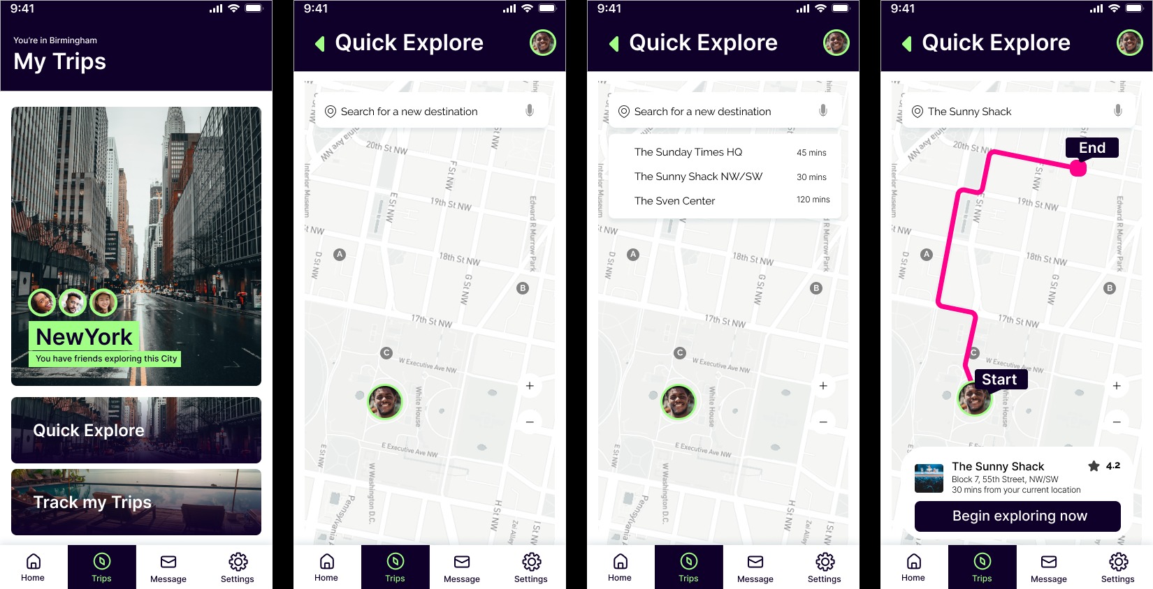
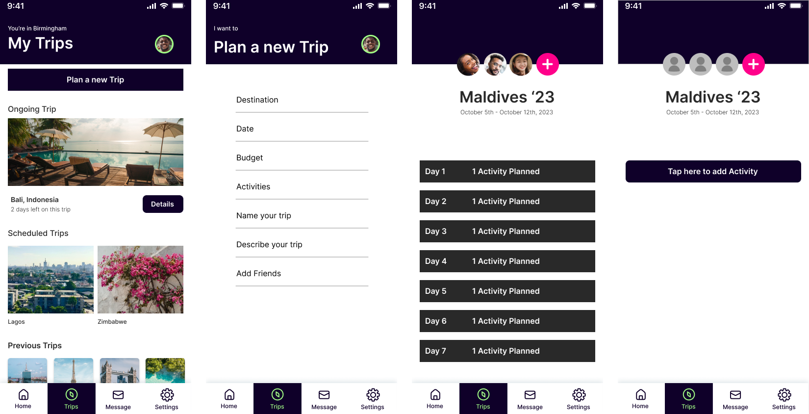
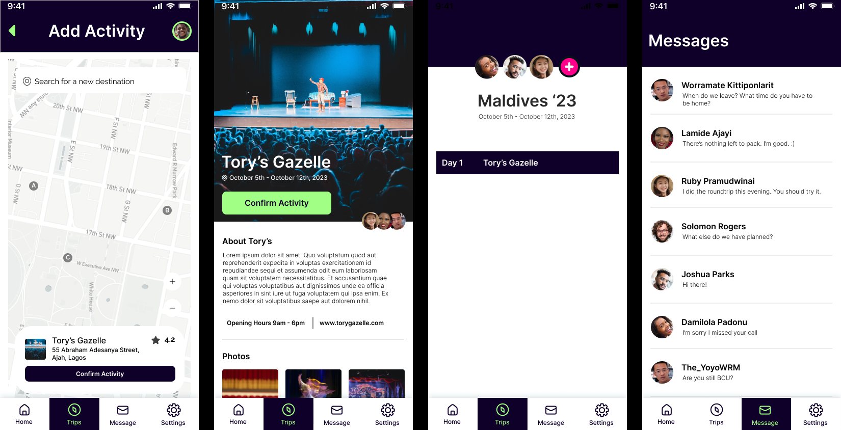
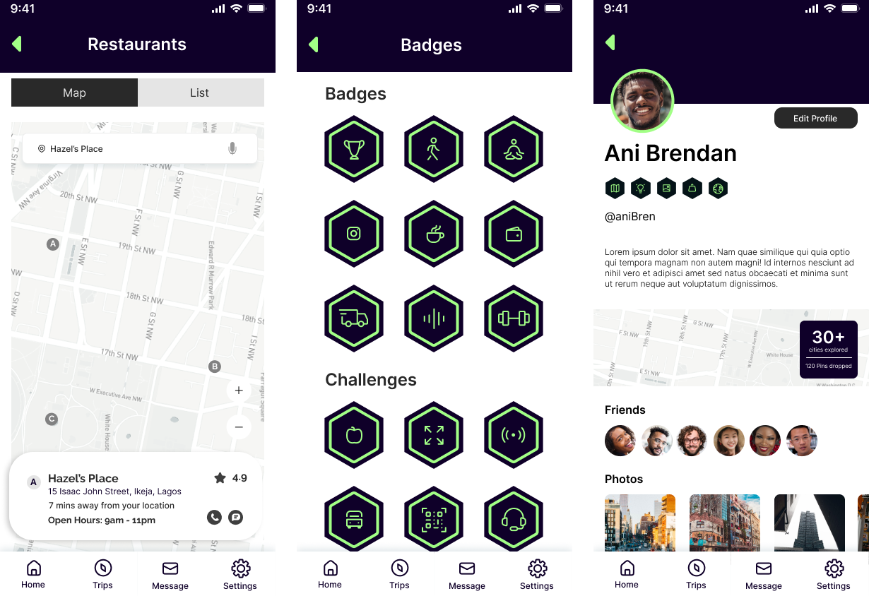
The goal of the “Goto” application is to make travel less boring for users and open cities up in fun and exciting ways. The application gamifies city exploration by presenting cities as stages with levels, checkpoints, rewards, and secret spots, in line with the themed approach to travel and holiday experiences.
Research
Mind maps were created to explore the primary concept of travel, from trips as short as walks to the corner shop to scenarios as extreme as intercontinental travel. For this exercise, the primary focus was more on the motivation than the method of travel. Desk research suggests that recent cultural occurrences like the COVID-19 pandemic has psychologically cornered people into a spot where they operate primarily from a place of fear. In that vein it was also important to investigate optimal strategies for coping with travel and exploration driven anxiety particularly for people in unfamiliar terrain.

01. EMPATHY
Finding the right audience
For this project I interviewed 30 people, and all the discussions revolved around travel. From trips down the road to 15 hour flights with multiple layovers. I was also blessed to connect with (and interview) a few people with auditory and visual impairments. They provided valuable insights towards the development of this project.
Key takeaways from the interviews were
- Travel is a very sensitive subject, as it is challenging for many people with impairments to travel without anxiety.
- Exploration is risky, because there’s a persistent fear of getting lost and not being able to retrace one’s steps. Not everyone is hyper-adventurous. Some people want to feel safe at all times.
- Routes are very important. Some people never break the routes their daily activities are built around, and sometimes live for years in a specific area without motivation or incentive to exceed certain limits.
- People hardly explore (even their local environments) and when they do, it is often times unconscious and serendipitous.
- Repetition creates emphasis. The fear of traveling or exploring alone slowly begins to fade as confidence in ones abilities grow.
02. DEFINE
User Requirements and WCAG
WCAG states that for applications should be perceivable, operable, understandable and robust, for them to be deemed fully accessible. Information should be easily accessible and perceivable to a wide range of users, including those with disabilities.
Due to how broad this spectrum is, there are different sets of guidelines have been set to cater to groups of users with distinct needs pertaining to whatever disabilities or impairments they may have.
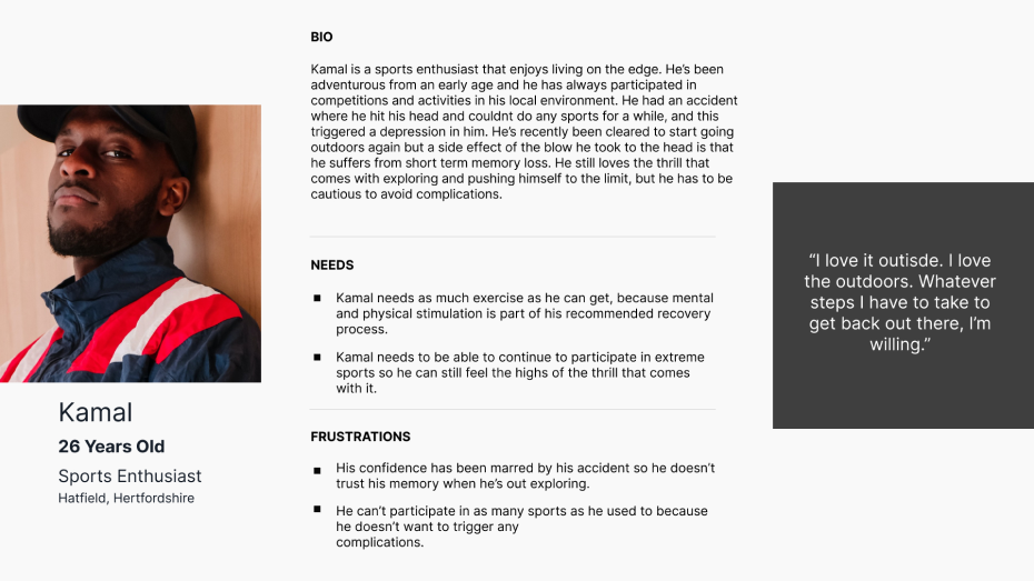
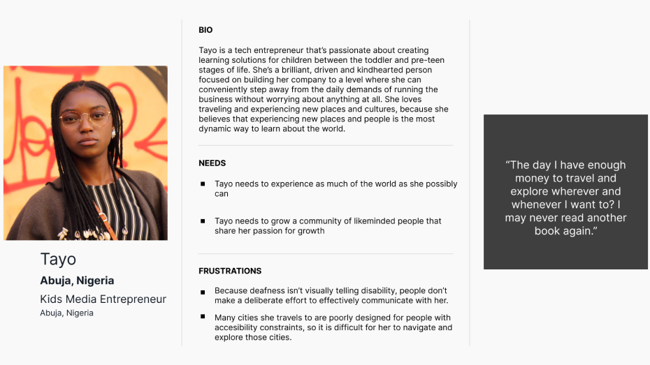
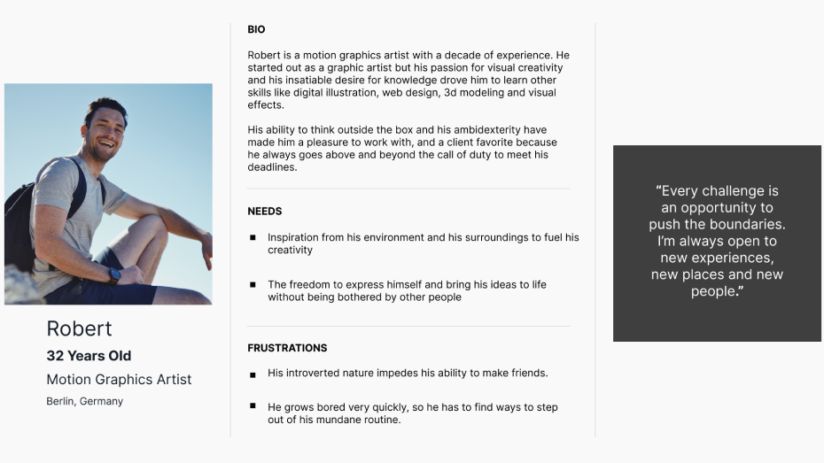
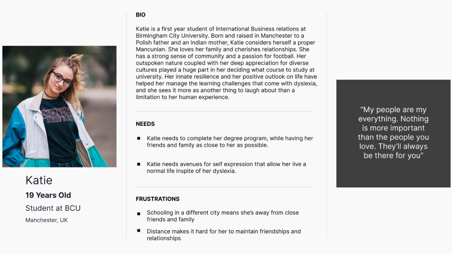
Personas
Building personas from a combination of interview data and desk research data, these personas were created to
help create empathy with prospective users and understand their pain points.
Sketches and Visual Exploration
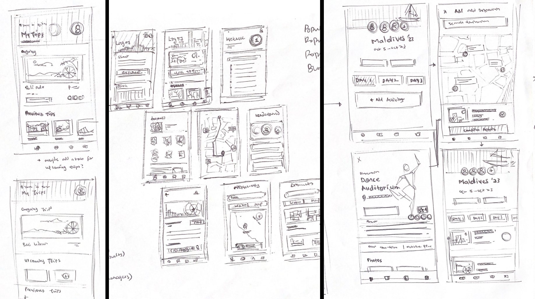
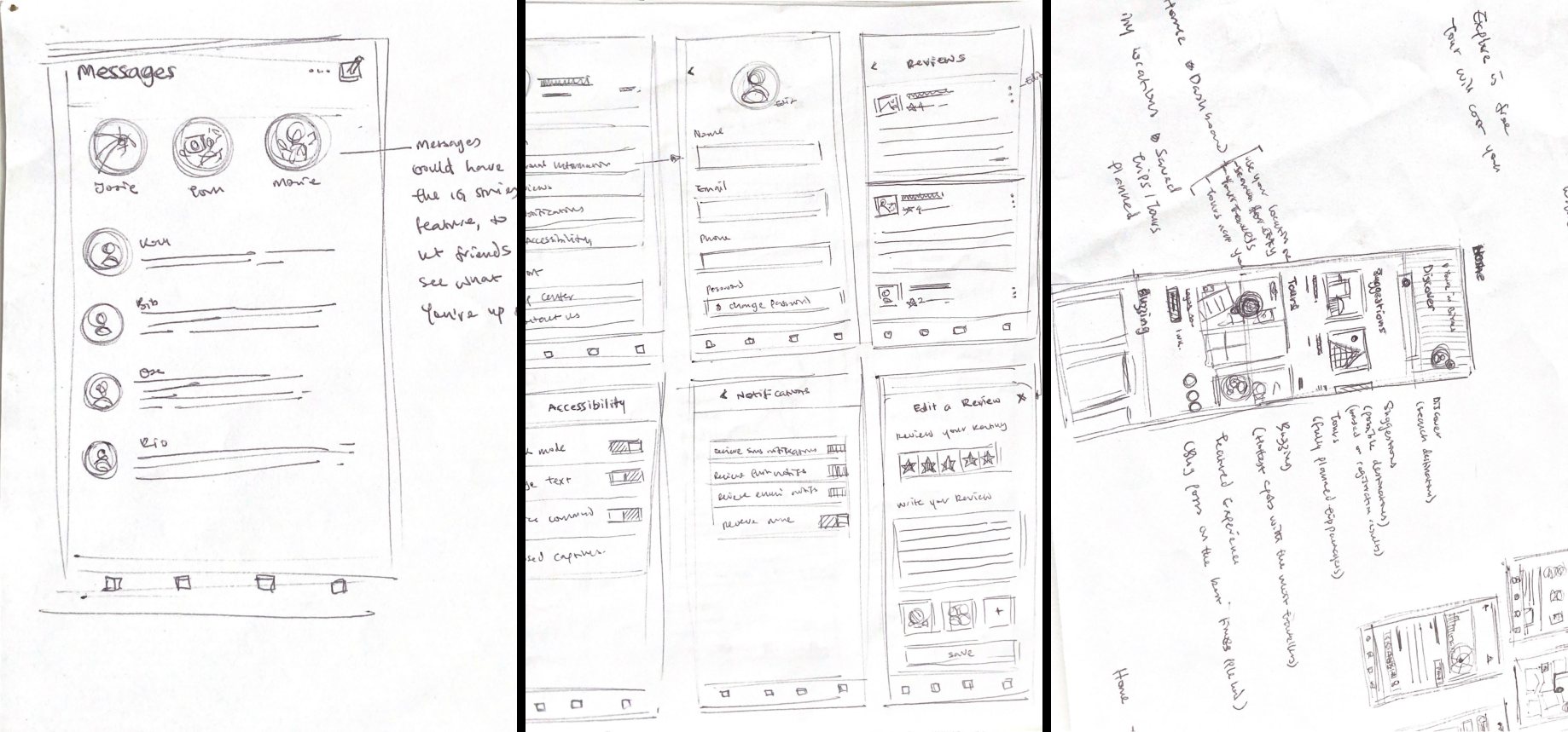
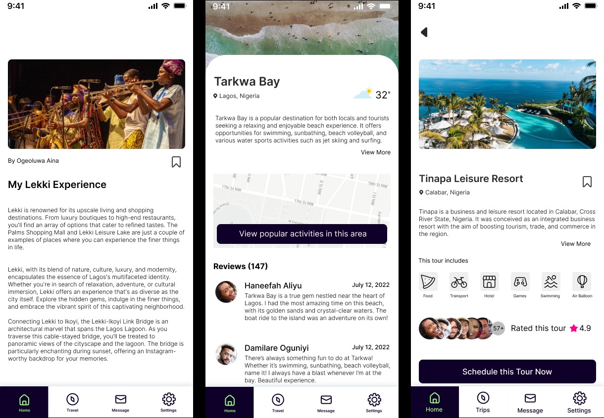
For this phase of the design process, the objective was to brainstorm initial ideas and explore quick and functional iterations of layout and content within the application. It was imperative that the main functions of the different pages were clear at first glance, so users can easily find their way around the application with little to no confusion. Paper sketches were created for the different pages and possible use cases that could arise, relative to the users' possible needs.
Contrast and Color Palette
Desk research showed that users struggle with descriptions that are solely based on color because perceptions of color differ between users. To this effect, it is imperative that color be one of the many ways information is conveyed. This is in line with WCAG (2018) success criteria 1.4.1 - Use of Color, which makes the application more accessible to users like Robert with visual impairments, which tend to affect individual perceptions of color and alter the ability to accurately distinguish between colors.

Target Size
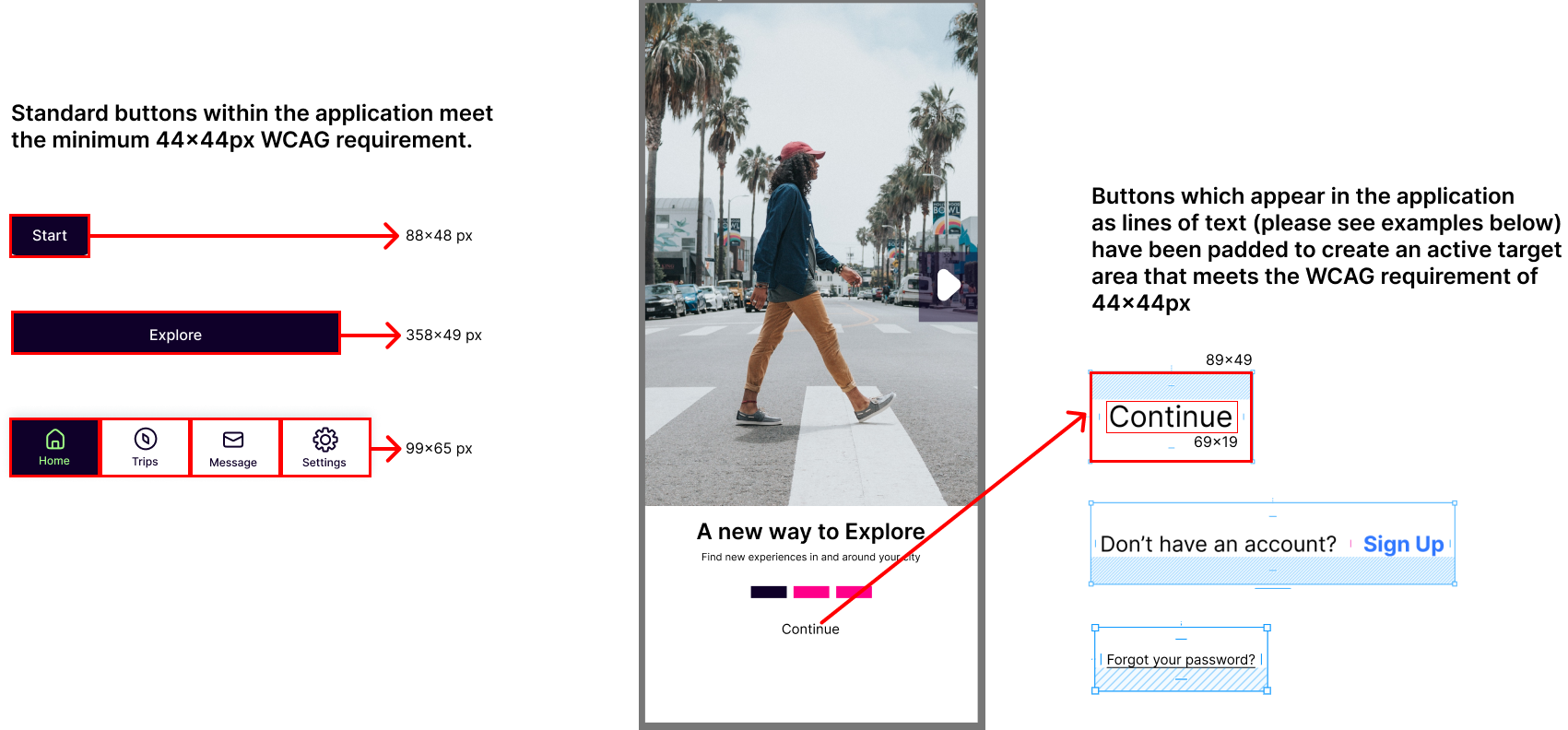
Precise motions needed to make correct selections on a touchscreen may be problematic for people with tremors.
In line with WCAG 2.1 (2018) success criteria 2.5.5: Target Size, The target size for all clickable items is at least 44 by 44 pixels, making the buttons easily accessible and clickable for Robert. This also meets AAA-level accessibility standards.
Resize Text
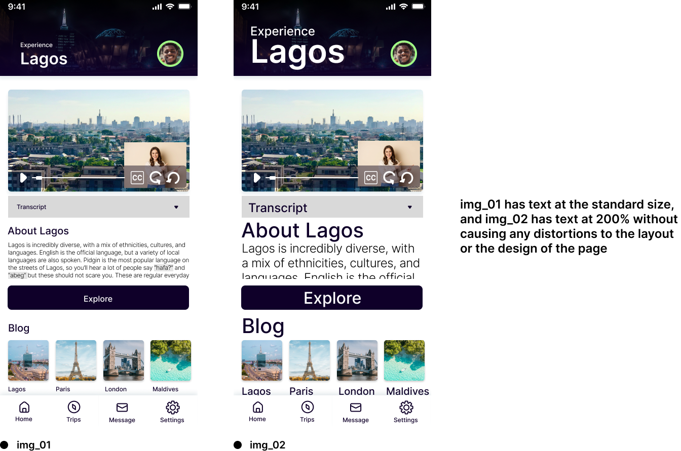
Research also showed that because users of low-vision accessibility aids sometimes struggle to adapt to changes in visual material, there is a widespread preference for visual information over text-to-speech choices. This creates a need for text that is easily visible and legible for users like Robert. In adherence to WCAG (2018) success criteria 1.4.4 - Resize Text, (except captions and images of text), which allows Robert to scale text to more readable sizes (up to 200%) without the need for assistive technology like screen magnifiers. This resize neither breaks the pre-established format of the page nor triggers a loss of content or functionality.
Visual Presentation
Users of low-vision accessibility aids sometimes struggle to adapt to changes in visual material, there is a widespread preference for visual information over text-to-speech choices. This creates a need for text that is easily visible and legible for users like Robert. In adherence to WCAG (2018) success criteria 1.4.4 - Resize Text, (except captions and images of text), which allows Robert to scale text to more readable sizes (up to 200%) without the need for assistive technology like screen magnifiers. This resize neither breaks the pre-established format of the page nor triggers a loss of content or functionality.
Captions and Sign Language
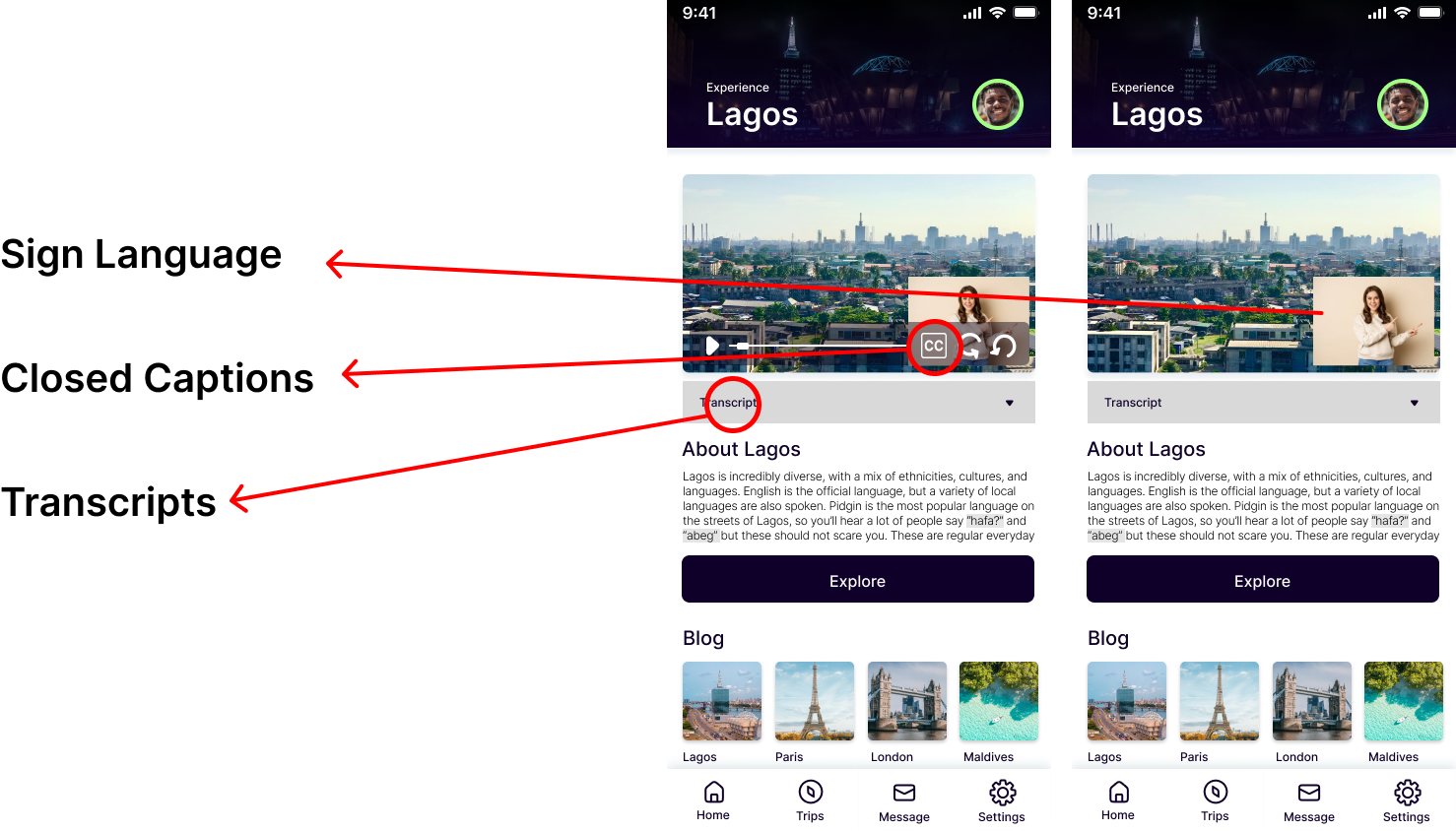
The most critical barrier for web users who are deaf or hard of hearing is the inclusion of multimedia content without text alternatives. Also, the provision of captions in video content increases accessibility for deaf users. To this effect, all videos in the application have been delivered with captions and transcripts in compliance with WCAG (2018) success criteria 1.2.2 - Captions.
Users with auditory impairments are as heavily reliant on vision for sensory input regarding their environments as they are when communicating through sign language and/or lip reading. For all video content within the application, there is sign language interpretation. This complies with WCAG (2018) success criteria 1.2.6 - Sign Language (Prerecorded) and meets AAA level standards.
Consistent Navigation
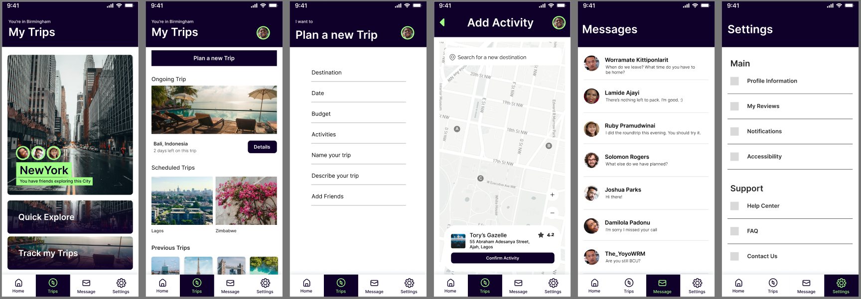
The navigation throughout the application is consistent as well, so that the mental model of users like Kamal isn’t disrupted by the need to relearn any navigational patterns. This is in line with WCAG 2.1 (2018) success criteria 3.2.3 - consistent navigation
Input Mechanisms
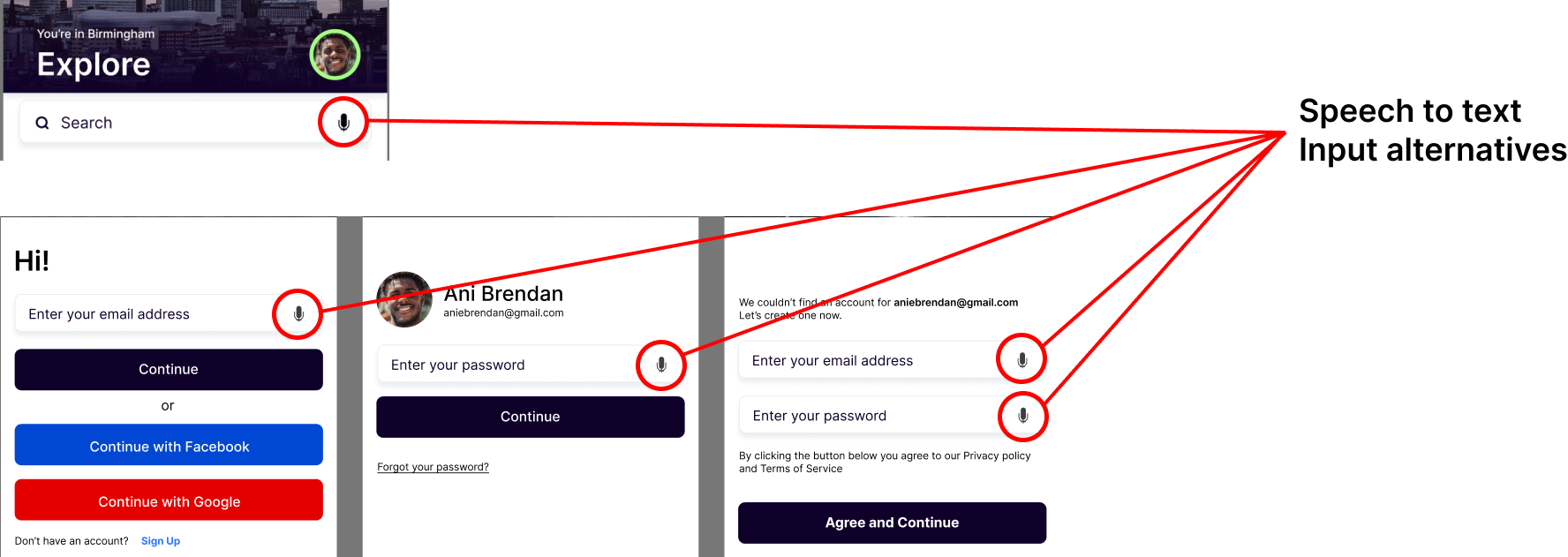
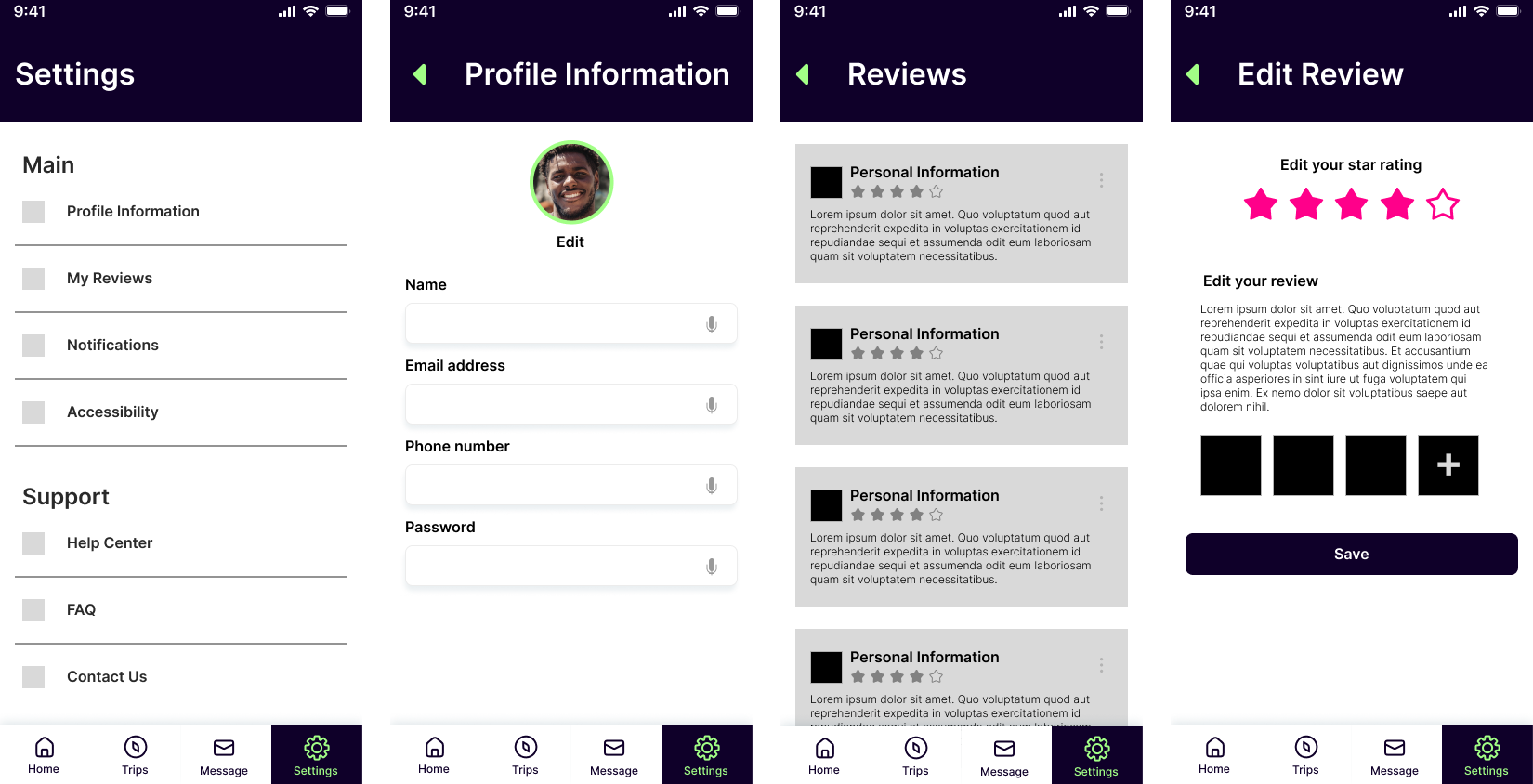
To ensure high input flexibility and that a user like Robert hardly ever has to type with his hands when he doesn't feel comfortable doing so, the application also has alternate text input mechanisms like voice commands and speech-to-text functionality, for every input field. This guarantees AAA-level compliance with WCAG 2.1 (2018) success criteria 2.5.6: Concurrent input mechanisms.
Final Design
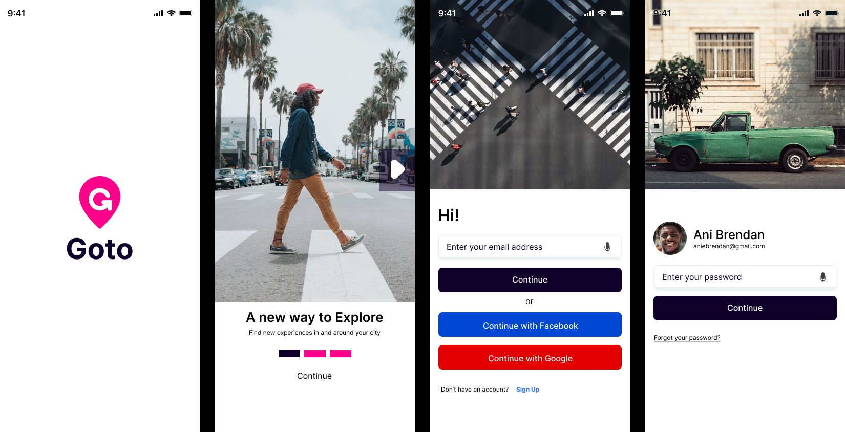
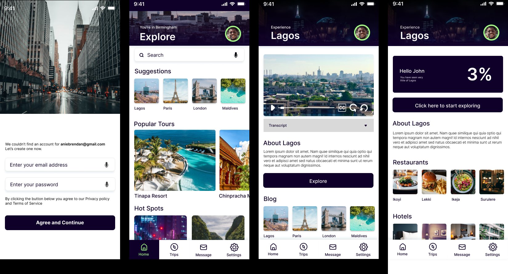
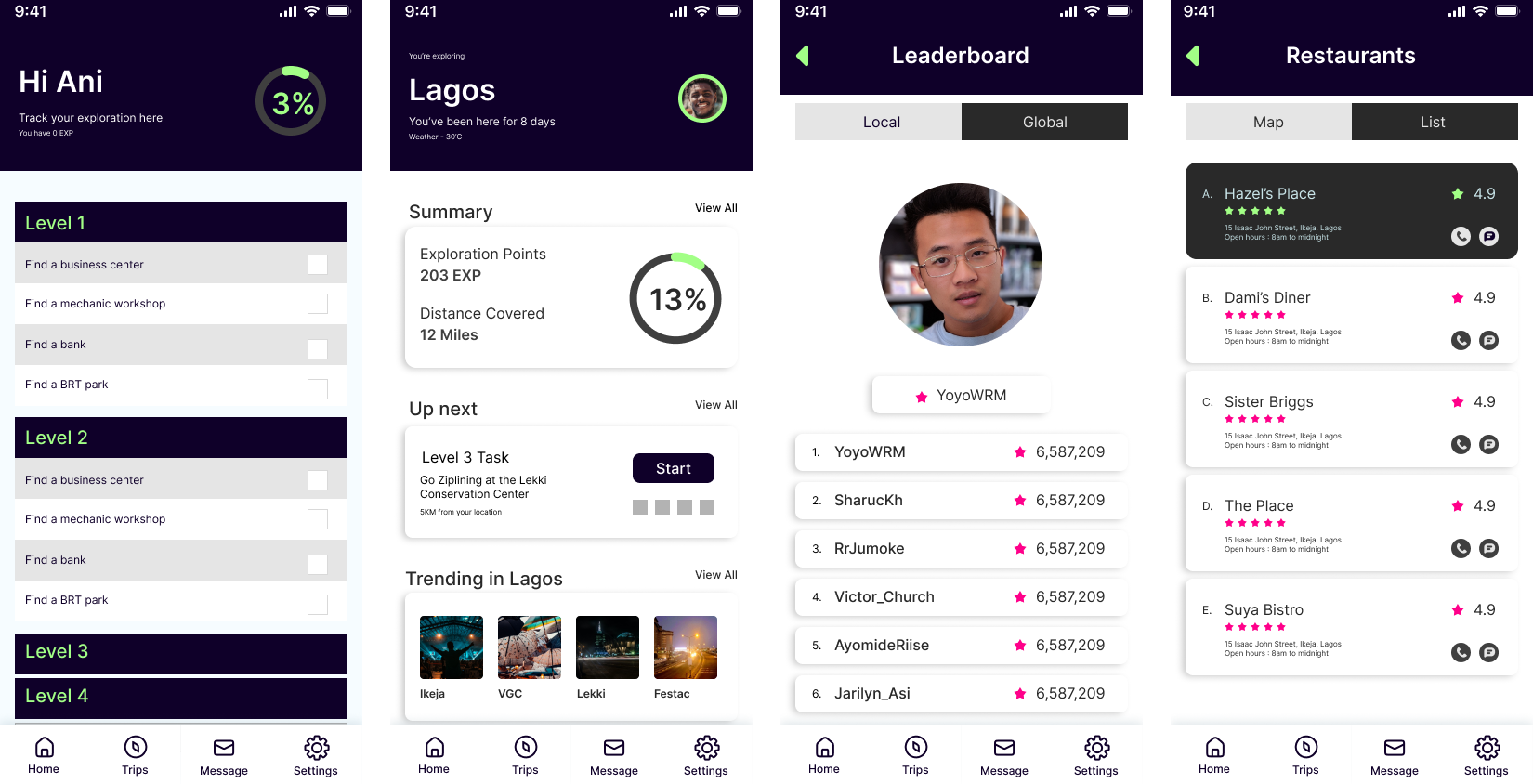
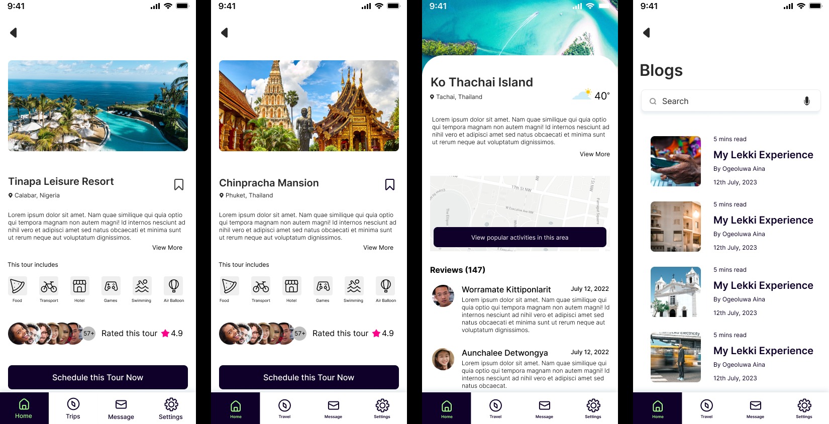
In 10 weeks the design of the Goto application was complete, with all the accessibility features (up to AA standard) added to increase its possible usability.
This project helped me familiarize myself with the WCAG guidelines and broadened my scope of consideration especially regarding accessibility for future projects.
Credits
Design
- Anietie Brendan
Supervision
- Arthur Theil