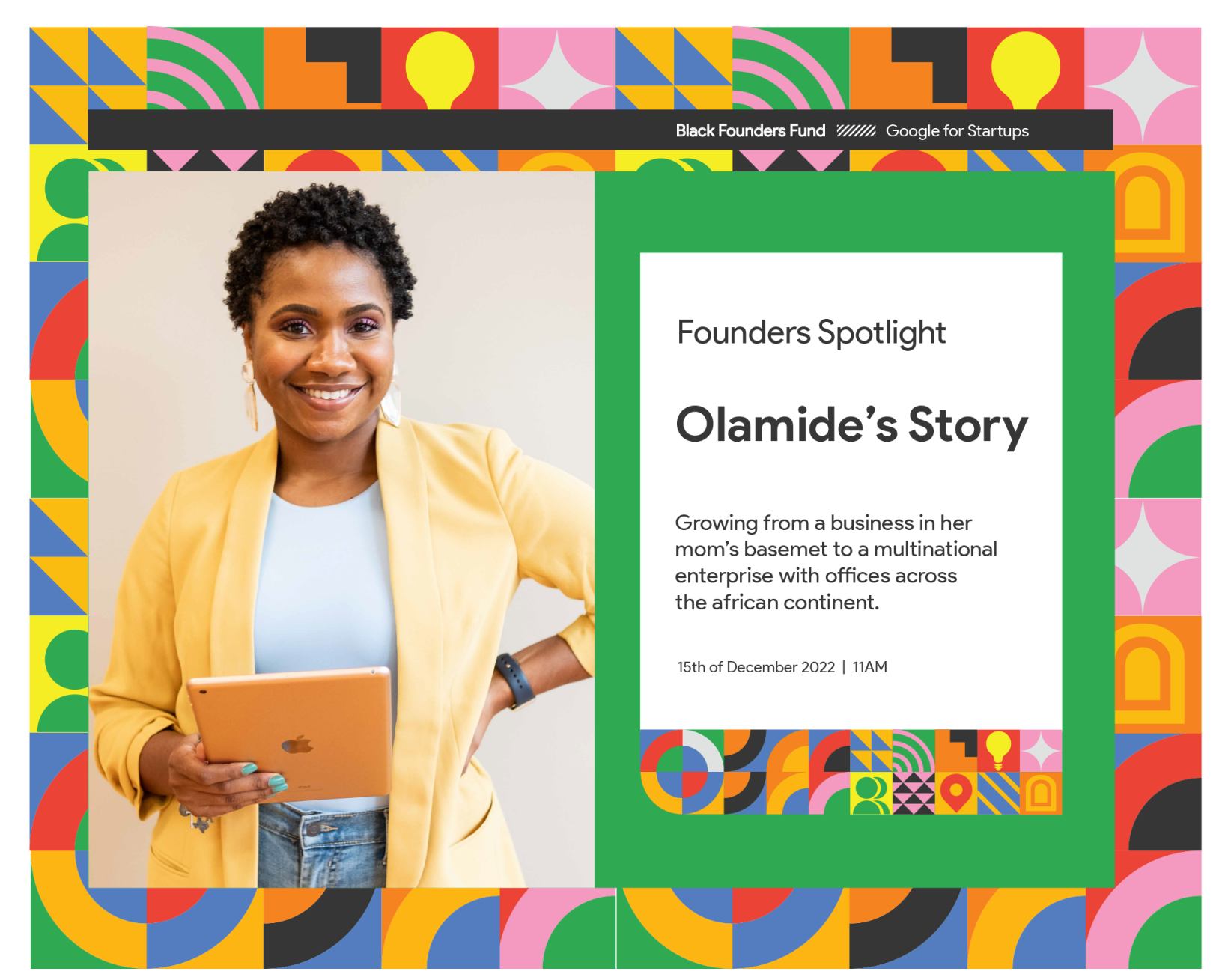
.png)
Revamp the Google
Black Founders Fund
Brand Identity
Add a refreshing spin to the existing brand visuals
and social media communications materials
Rationale
The Google logo. Classic. Everybody loves the Google logo. Not many people have bothered to ask themselves why.

Factually, the Google logo is an exemplary display of well balanced design. Its silhouette is clear, visible and easy to interpret. It is symmetrically composed, with the flow and balance of color offsetting said symmetry ever so slightly.
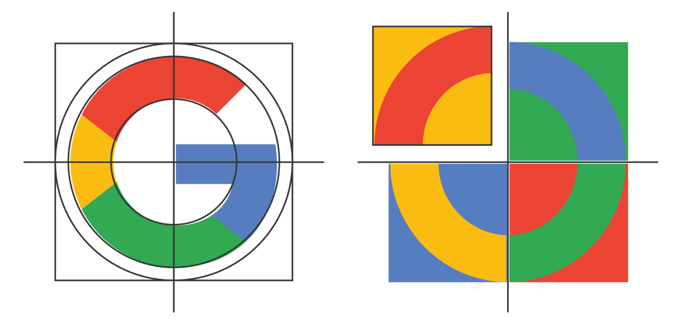
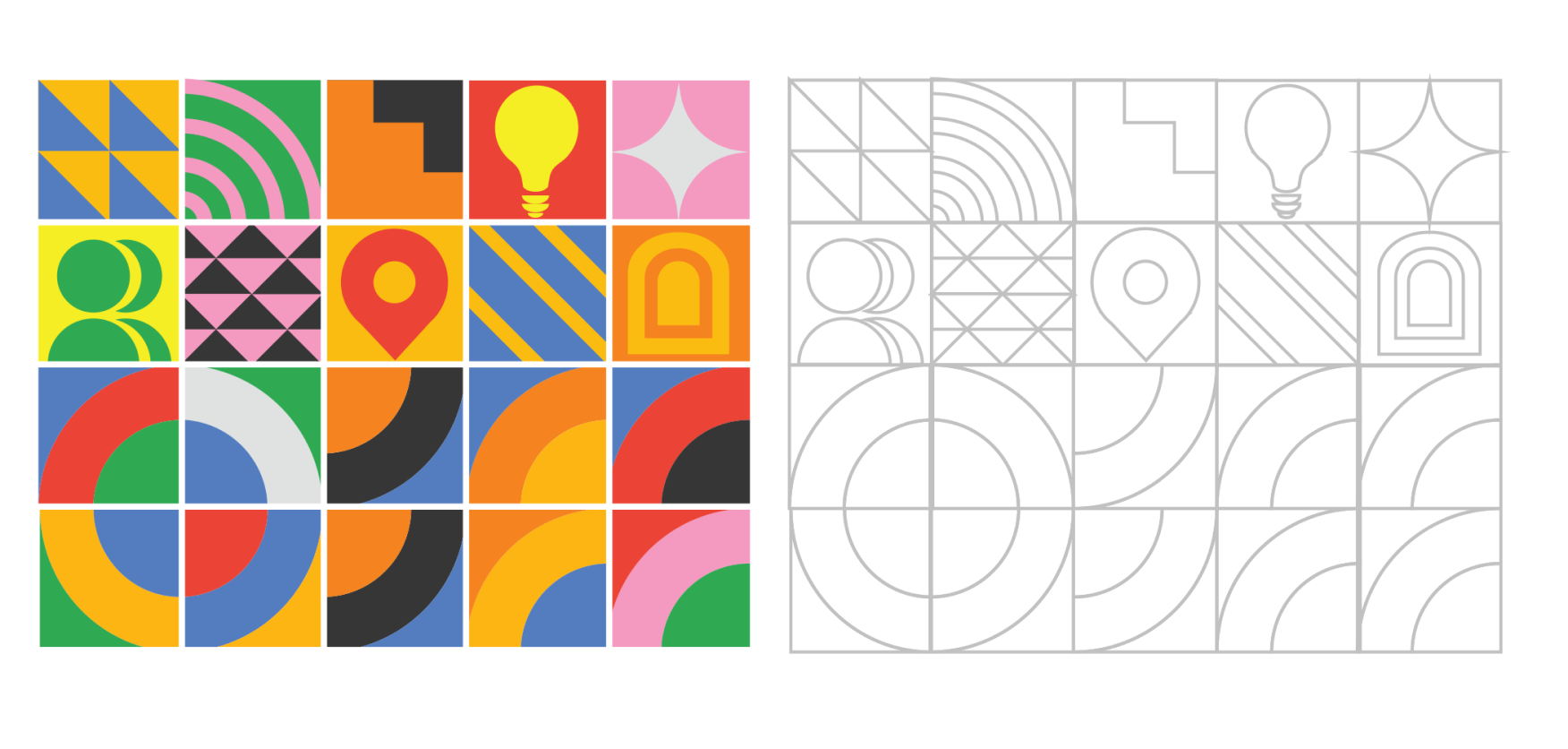
It is easy to split the logo into equal quarters which will deliver the same result regardless of how you rotate them. It gets a little more interesting when you take each of these quarters and move things around a bit.
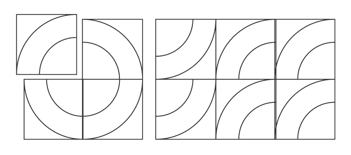

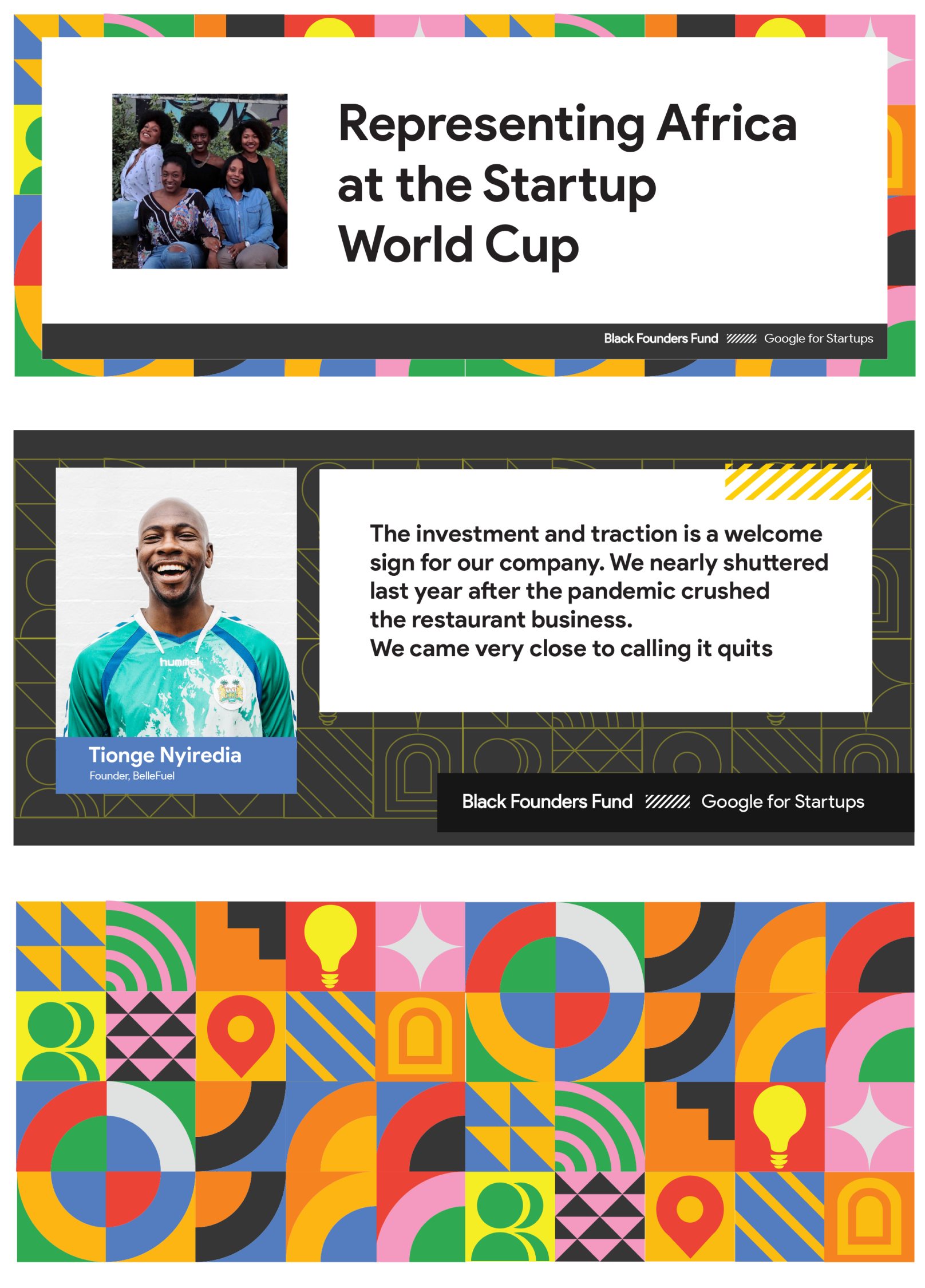
Combining the color palettes of the Google and Black Founders Fund brands, we arrive at an aesthetically pleasing Bauhaus style design capable of serving as the dominant design element of the program across different mediums, open to implementation across different styles and applications.
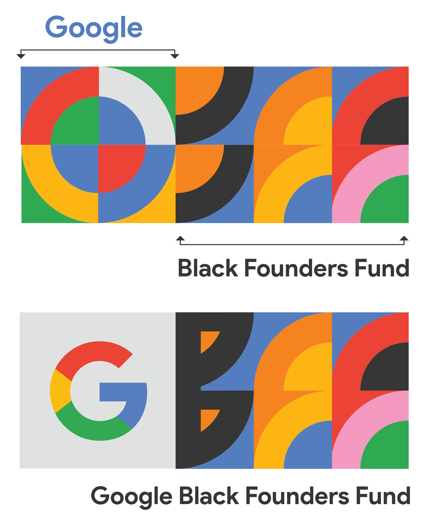
In line with the objective of the Black Founders Fund fostering the tenacious entrepreneurial spirit and encouraging as many founders as possible who have aligned with their ideals, a few components representing these values have been depicted with the goal of supporting the existing design and adding to the colorful pattern.
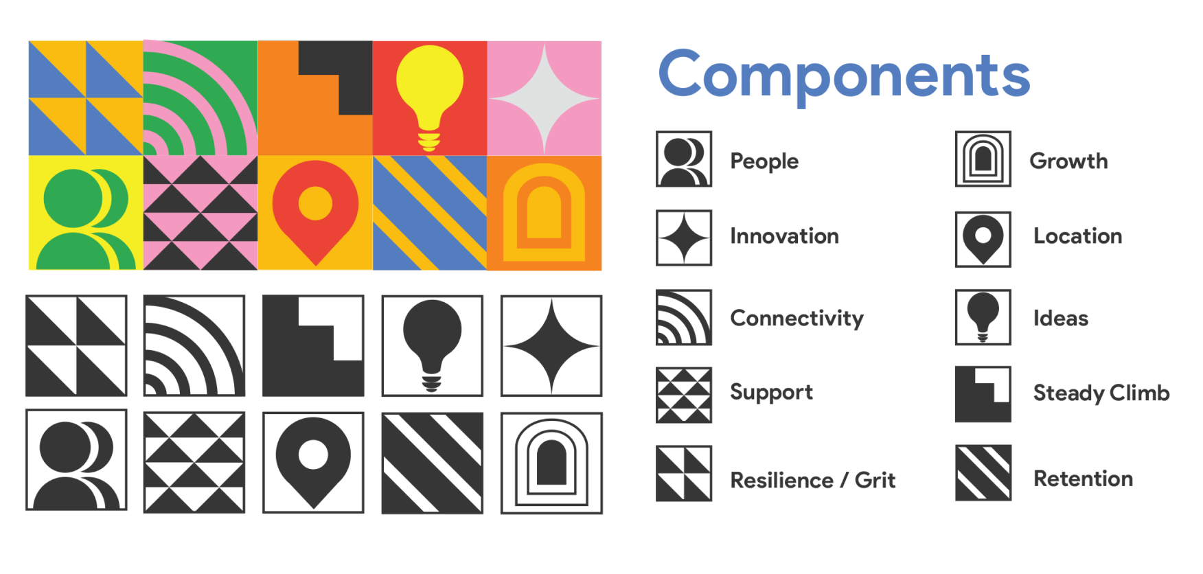
This fusion gives us a rubic's cube of visually appealing and culturally relevant elements that serve as a good base that can be created around. All visual elements for the campaign will be supported by this pattern, within two main categories. The vibrant, and the conservative.
Social Media Assets
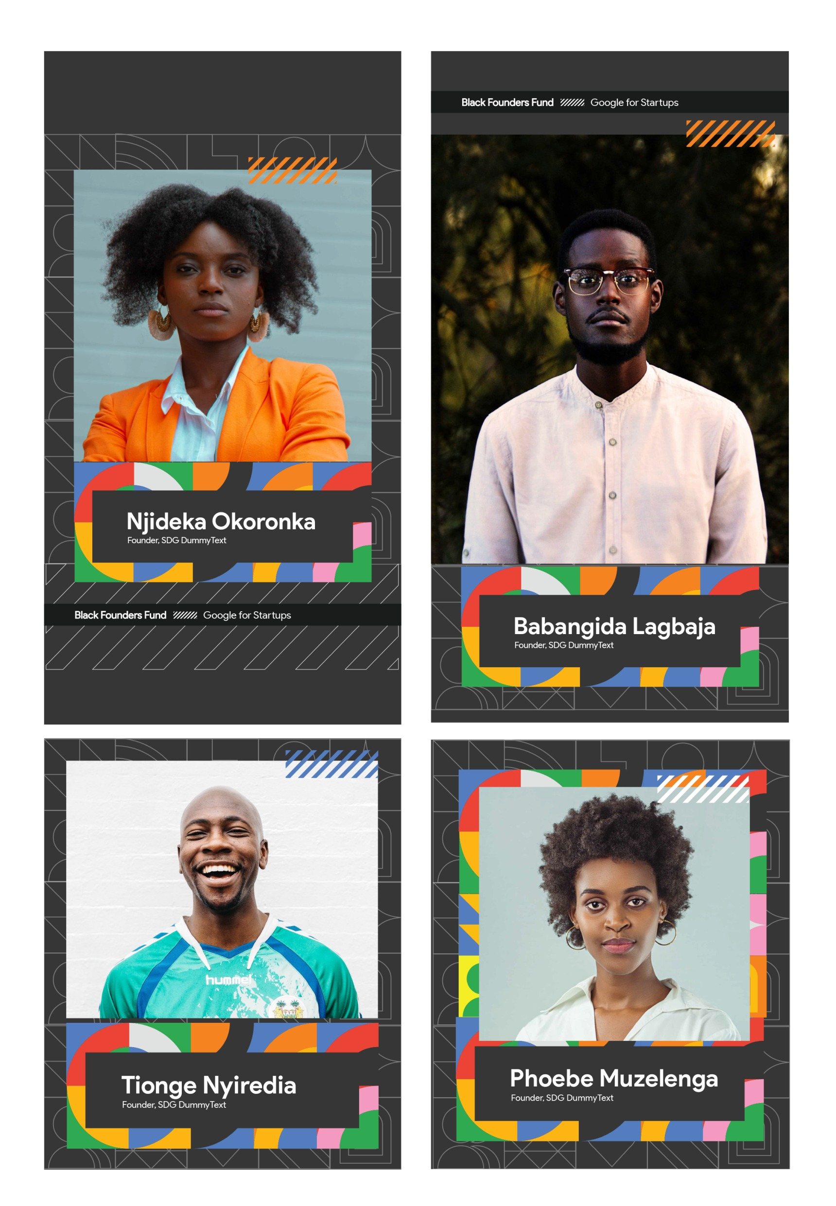
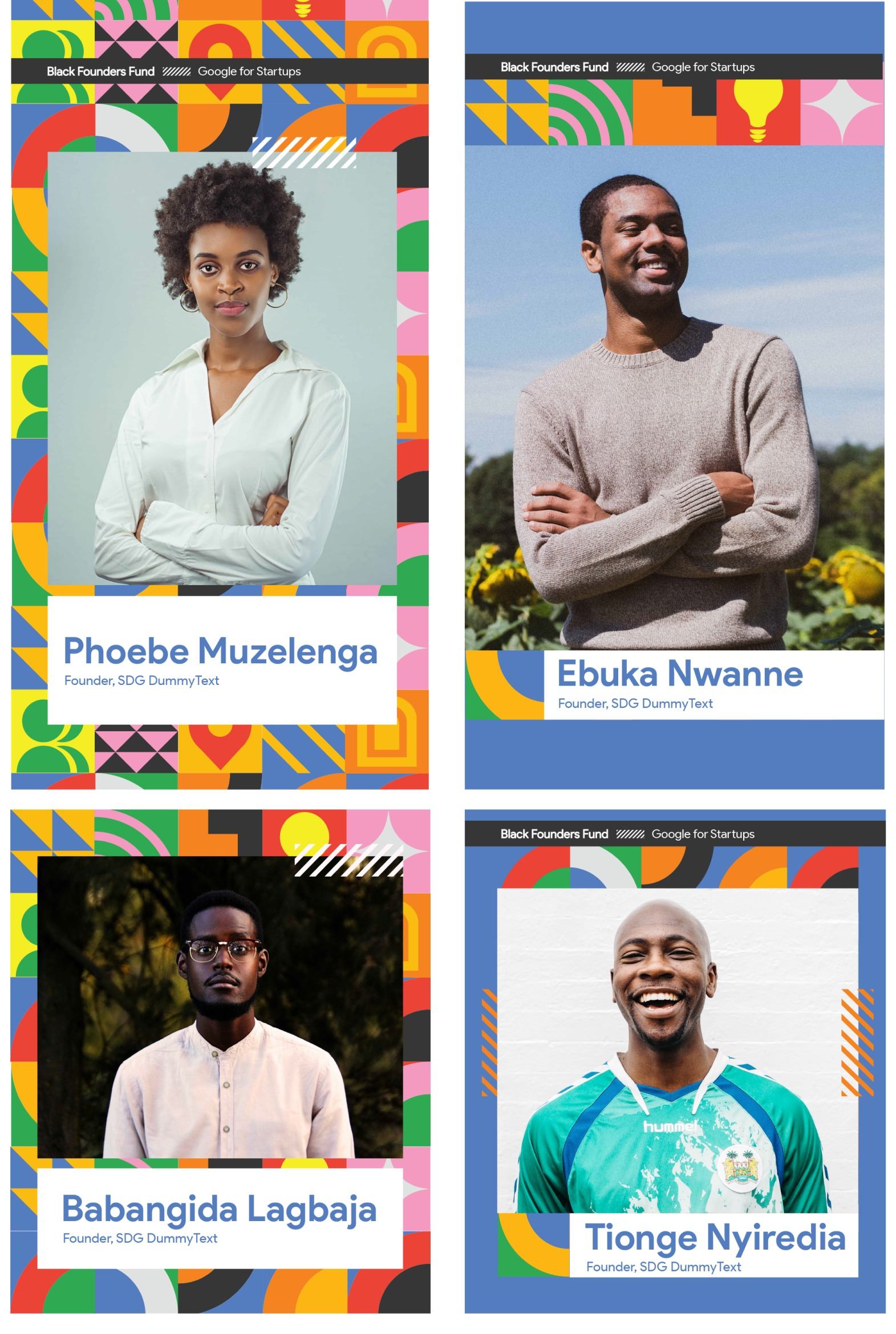
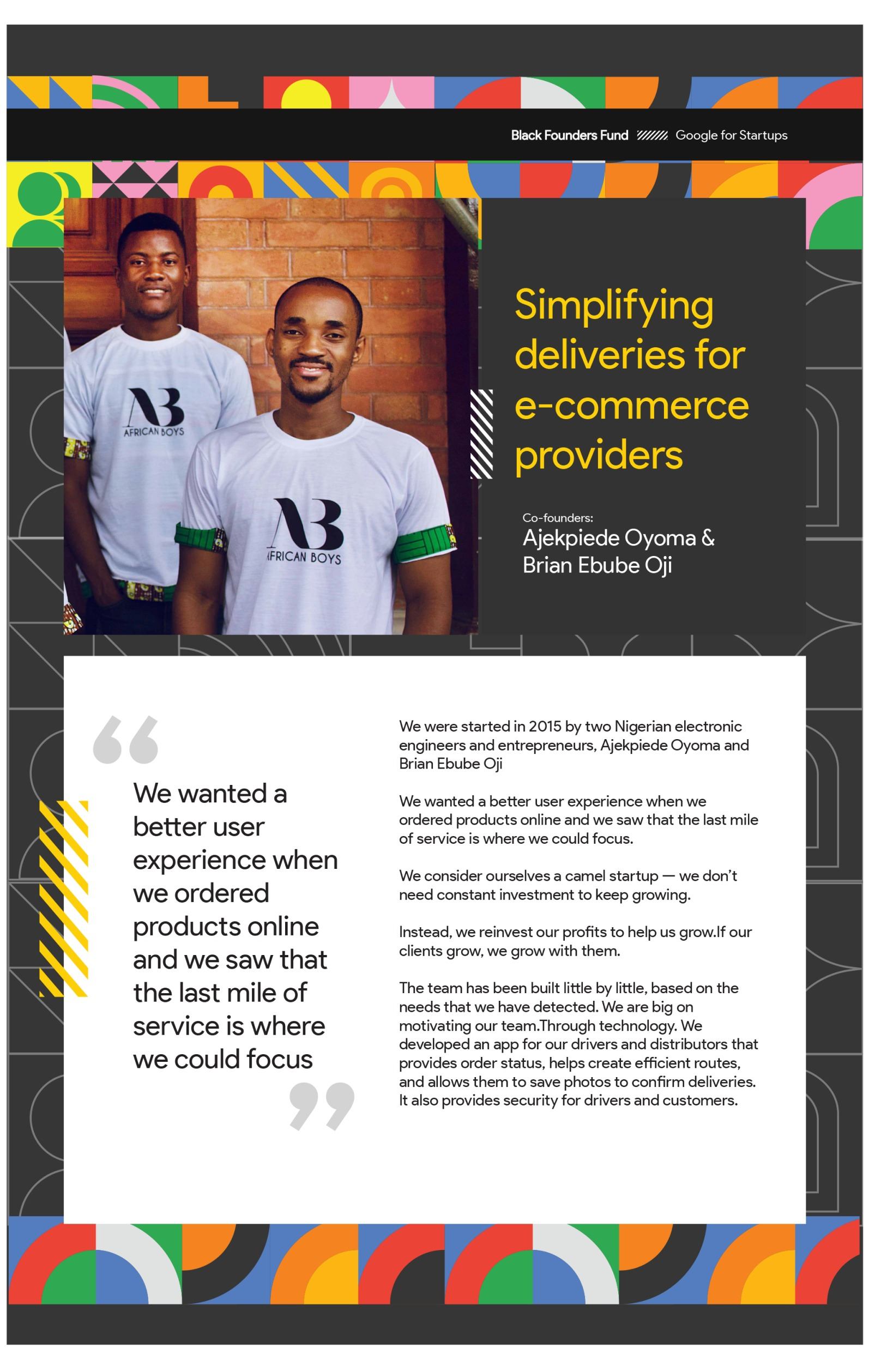
Templates were designed in different sizes and aspect ratios to fit various formats for social media posts like Instagram stories and reels, as well as twitter, LinkedIn and Facebook banners with the aim of communicating a consistent brand look and feel across all platforms. Consistency without monotony was the objective at this stage.
The generated pattern was adapted to different looks with the primary colors of the brand alternated for dominance across the designs.
