Background
The continent of Africa boasts of a resource more valuable than minerals and precious stones. Its human capital is grossly exploited and heavily underdeveloped.
Total Athletes Sportal Africa (TASA) set out with the goal of developing the sporting talent within and around the region, with the hopes of exposing these talents to the world early enough in life to help them keep up with their counterparts and contemporaries from other parts of the globe.
The Goal
TASA is positioning itself to enhance youth discovery and development in Africa by delivering a fully integrated sports talent discovery and development portal.
The major touchpoints to guarantee success of this goal would be if the platform could
- Connect talent to opportunities and resources
- Connect stakeholders to talent
- Create and avenue for stakeholders to interact
- Allow talent engage with stakeholders that will contribute to their development

The Challenge
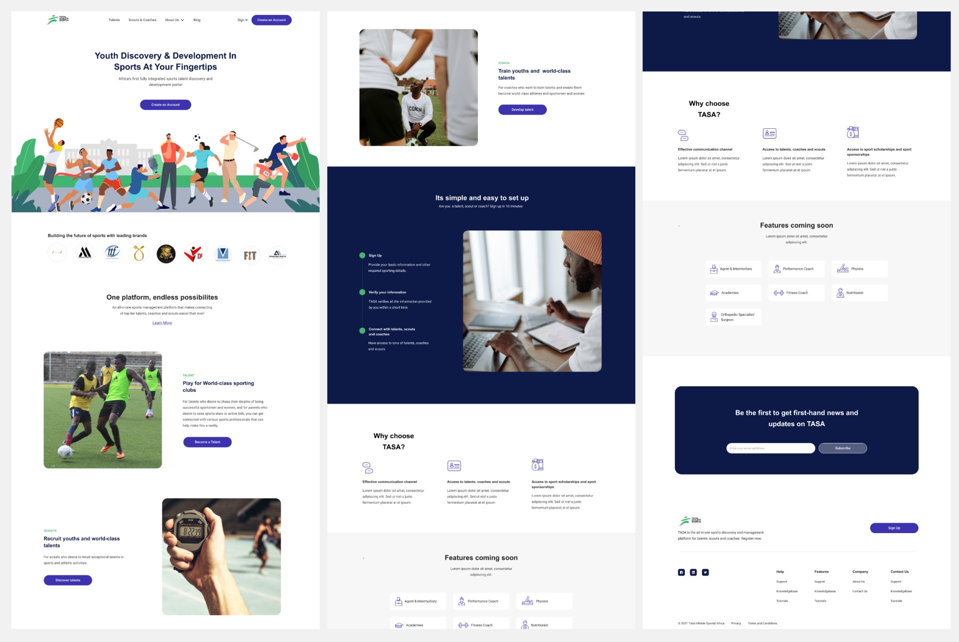
While external agencies and organizations have tried to meet the aforementioned goals and solve these problems, peculiarities of the region from societal and cultural perspectives have been insurmountable. Being a locally founded organization, ideas and strategies for implementation had been put in place and were yielding results. However, existing visuals did very little to help the cause. Inconsistencies between the brand design and the web presence inspired very little confidence in potential stakeholders who interacted with existing online material.
My objective was to design the brand website and web portal to meet standards reflective of the goals and ambitions of the TASA brand.

The “people” side of things
Before starting the redesign off, I had conversations with different stakeholders of this project. From conversations with the brand owners, to conversations with the employees at the company at different levels. Those out in the field that interacted with the talents directly, and those in the office that handled daily operations at TASA.
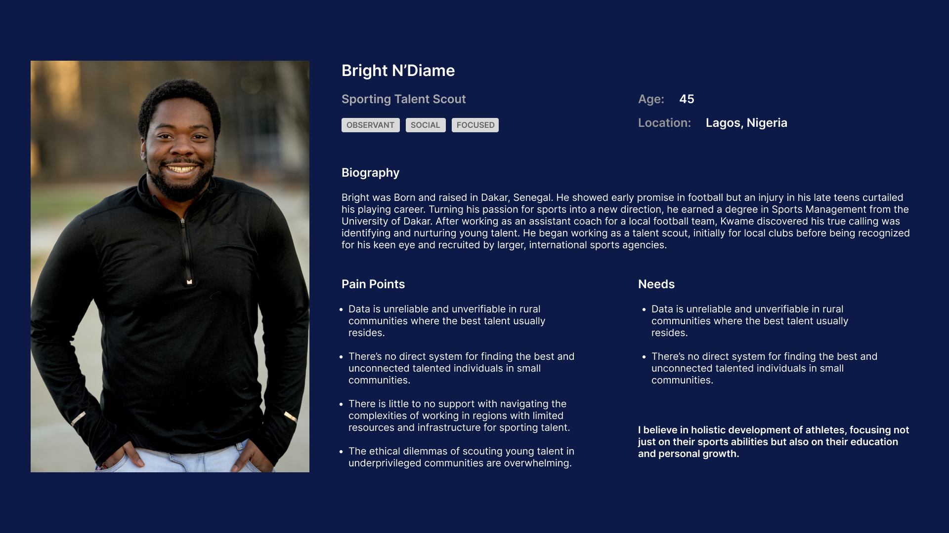
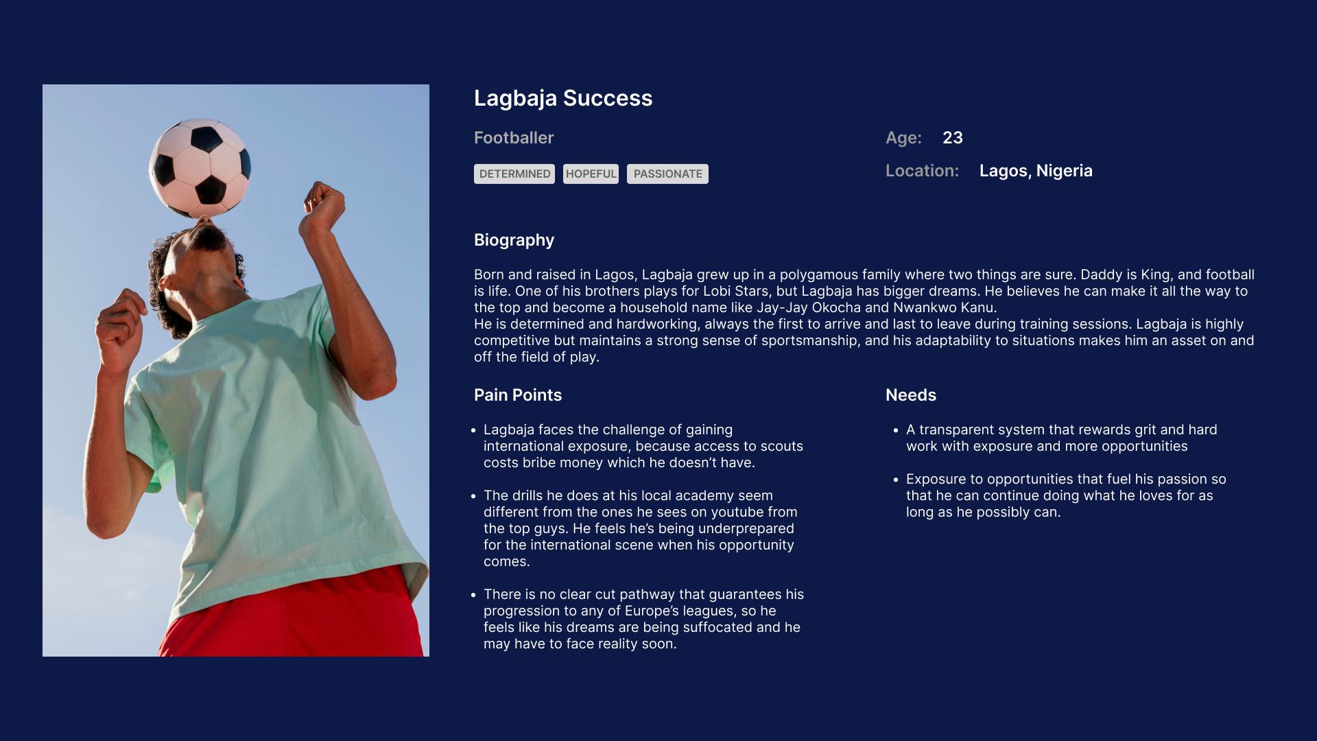
Conversations were also had with talent scouts, their representatives, and the talents themselves.
I wanted to know what made the work they did at TASA so important to them. I wanted to know how the talents and their representatives felt their vulnerabilities and interests were acknowledged and catered to. It was important to understand what the scouts and academies felt would make their operations run more smoothly, then try to visually represent these in the new design.
Personas
Collating and sorting the data we gathered from our interviews, we created these personas to best represent our target users.
Design Audit
The old design was audited to assess its suitability for purpose of helping the brand connect effectively with its target audience and identify the improvements necessary for a more engaging user experience.
Landing Page Restructure
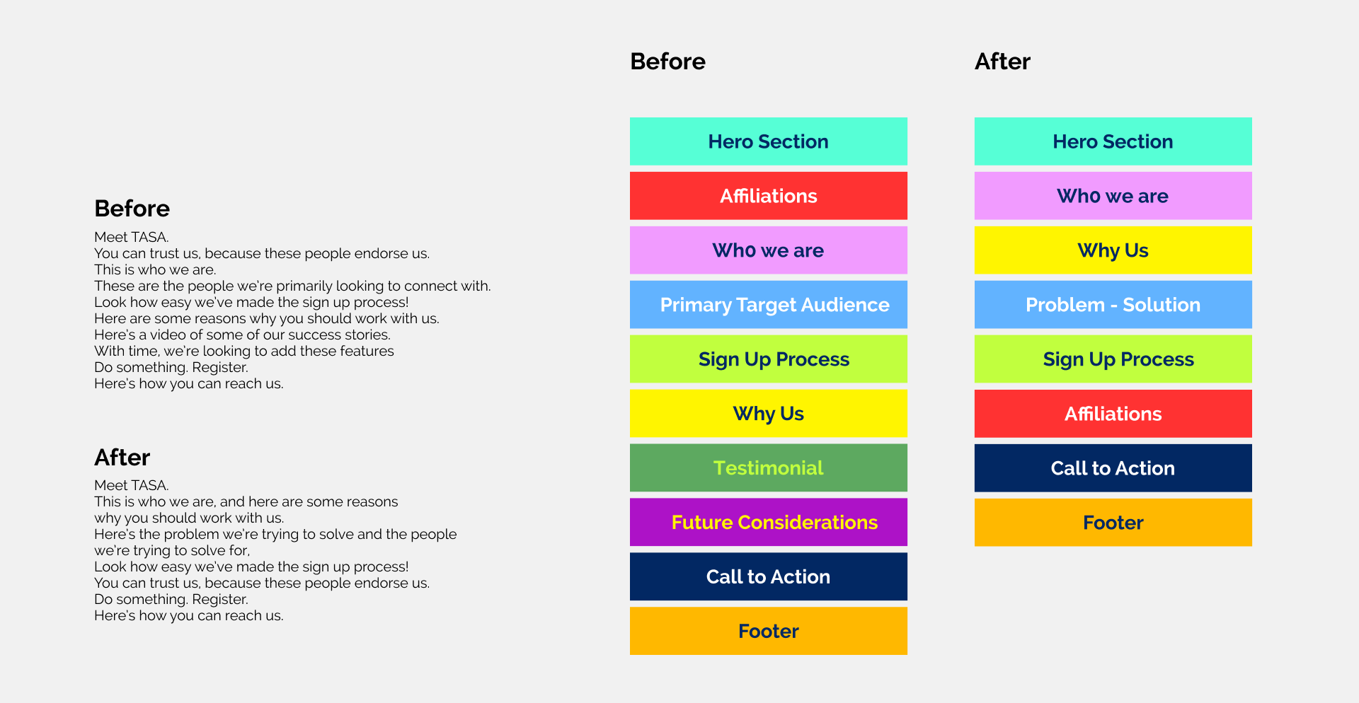
It is imperative that the messaging and information architecture of said page communicates the brand offers as optimally as possible.
I like to think of it as a conversation being had on primary encounter with a total stranger.
What’s your story? What narrative are you trying to push?
The order in which facts and information are presented tend to affect how convincing you sound, and determine how effective your message is.
Design System
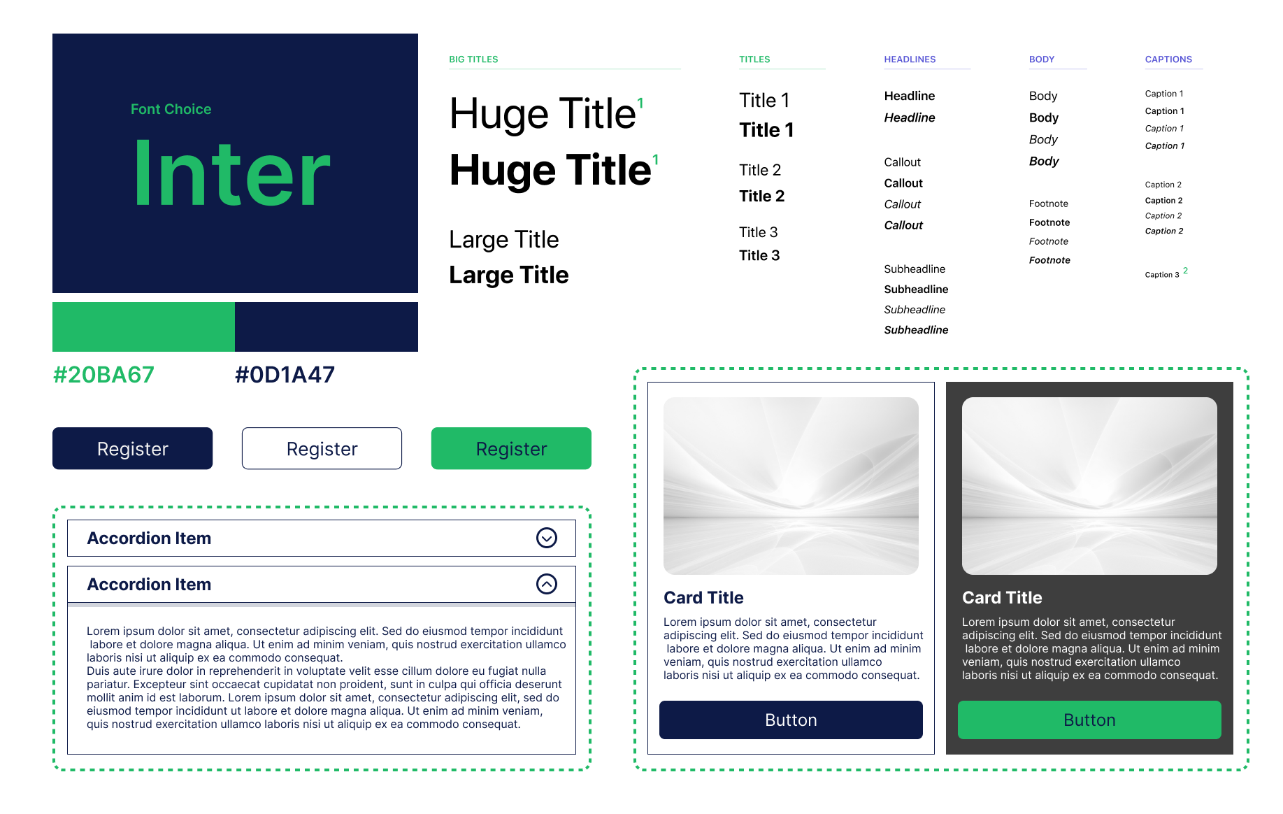
The previous design was also improved on, by introducing a single modern typeface with weighted variations to enhance readability and accentuate the information where necessary.
Previously, five colors associated with the brand. These were reduced to two, establishing a clear visual hierarchy and reducing cognitive load on the users by leading focus through design.
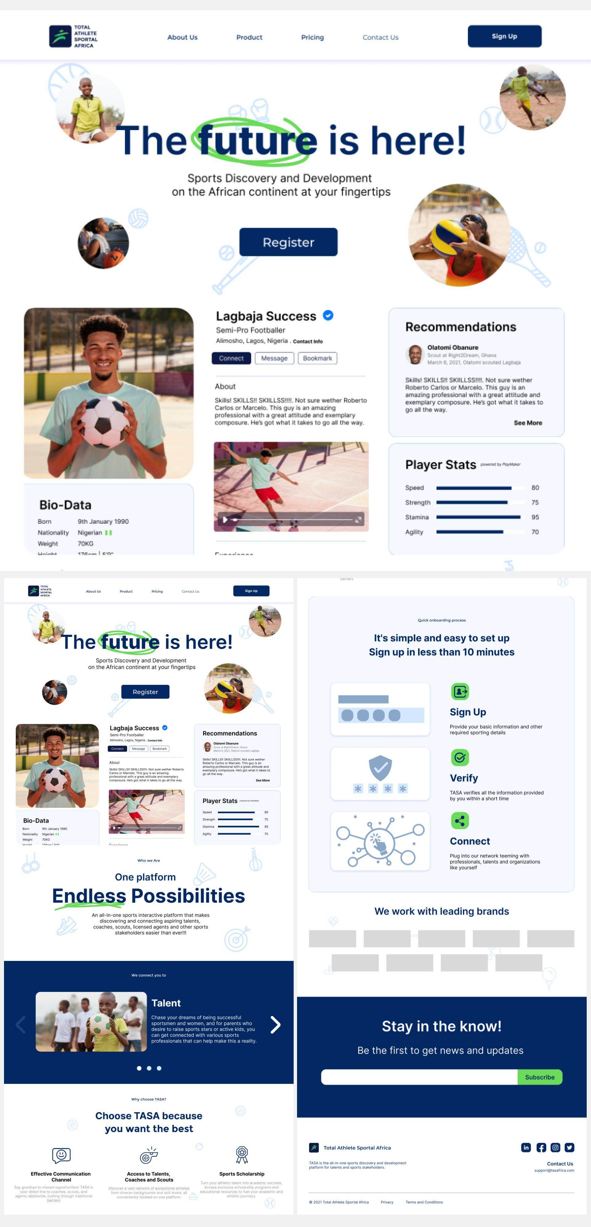
Landing Page redesign
The redesigned landing page is a clear communicator of TASA's commitment to the future of sports development, with visual cues like images and vector illustrations specifying the commitment to multiple sports and development of young talents at the grassroot level. The screenshot of the web application and the buttons on the page increase the ease with which users can register or sign up on the platform.
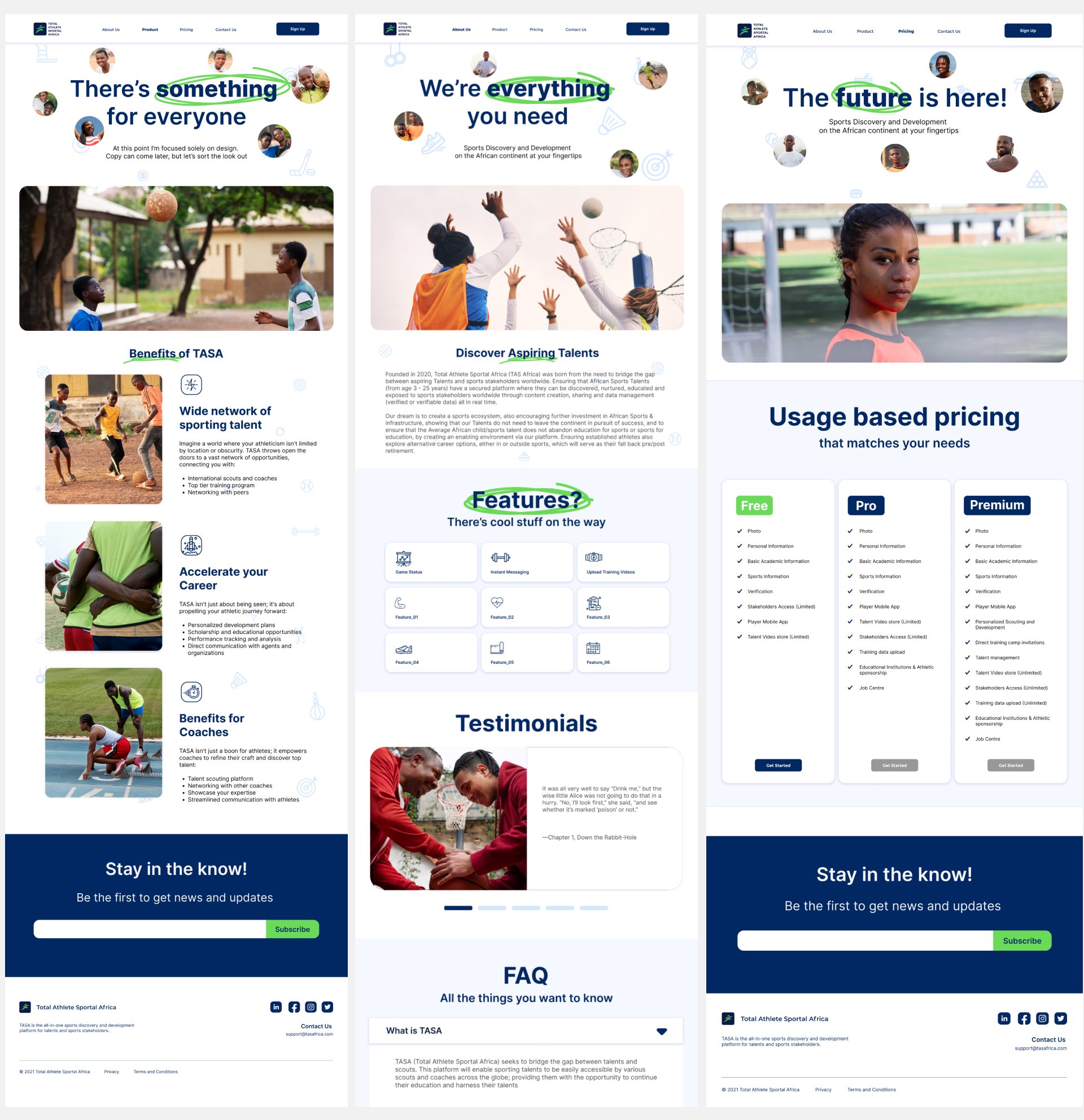
Final Designs
At the end of the process, the full website redesign was completed to reflect the needs of the brand to communicate its commitment to youth and sport development while maintaining an appealing visual aesthetic, and encouraging users to register with little to no friction. The process from inception to completion took about 8 weeks.
I'm proud of the turnout of this project, and I like that this project offered me the opportunity to explore yet another industry I might have otherwise been oblivious to.
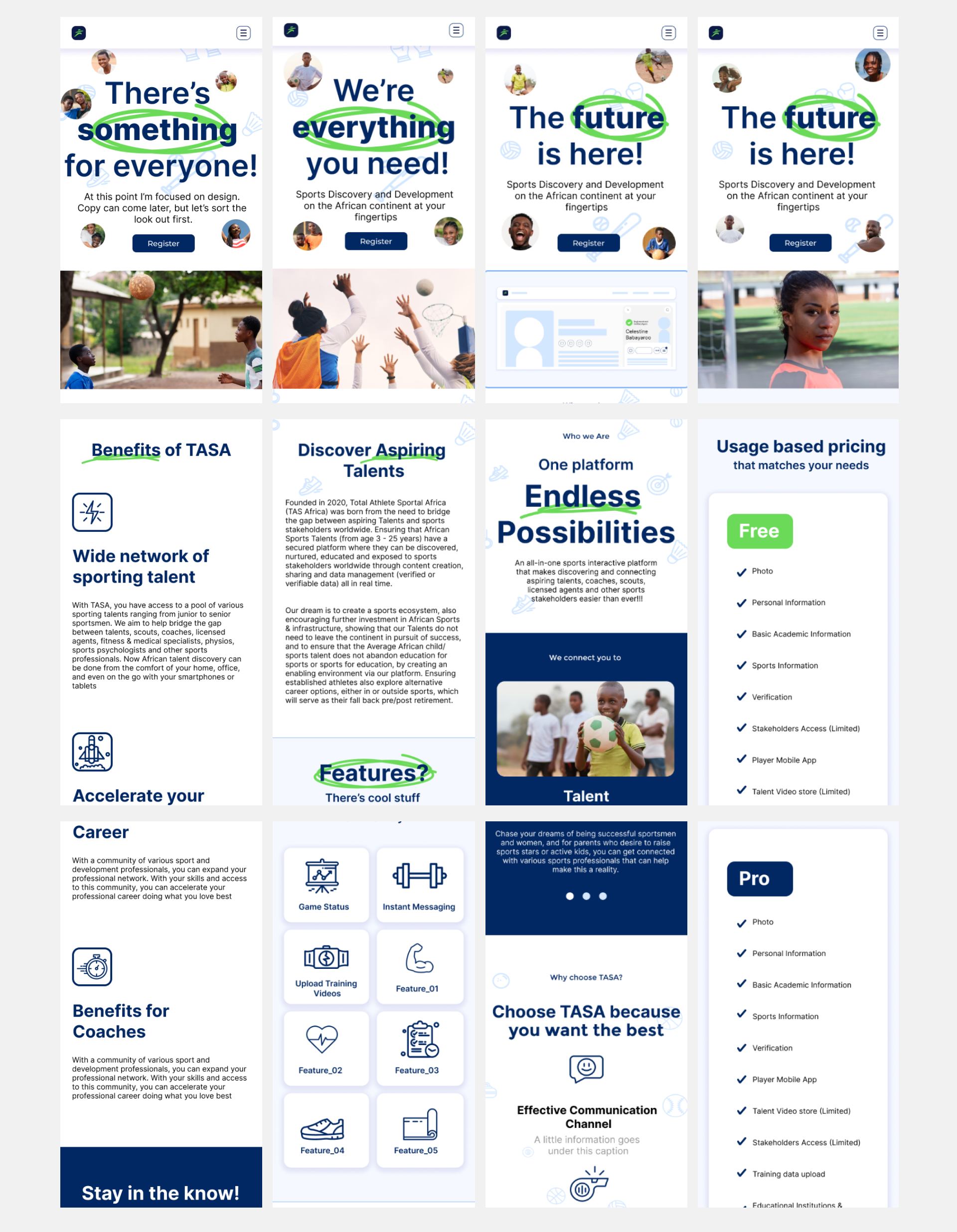
Fit for mobile
The designs were adapted to fit on mobile screens and tablet screens, so the fidelity of the information is not compromised on smaller screens.
Credits
Design
- Anietie Brendan
- Ogenna Ogbogu
Supervision
- Dipo Rufai