00. INTRODUCTION
Background
Young people leave their homes or countries in search of greener pastures everyday. They need to find support for their families financially.
While the demands that come with healthcare require time and money, it is challenging to give the two.
As a result of this, their sick and ailing loved ones tend to become a burden.
The Challenge
Can we build a system that grants access to healthcare without the hiccups and bottlenecks of long wait times, disruption of schedules, and unverified levels of quality and expertise?
Is it possible to treat healthcare on a household level while paying attention to individual needs within that setting while keeping all parties simultaneously happy?
We dared to try.

01. EMPATHY
The Who and the Why
We interviewed 40 people between the ages of
21 and 40 years old, and tried to understand their needs, concerns and frustrations regarding the subject of general healthcare.
We asked questions around general healthcare, past experiences, challenges they faced, difficulties they encountered, and resolutions if any.
- What’s your general experience with health care?
- How do you monitor health care for yourself and your loved ones?
- Do you have any religious or cultural reservations around receiving care for your elderly people? If yes, can you please share what they are and why they’re important.
- Tell me about a time when you received healthcare that felt like you got value for money.
- Have you or your loved ones had any major health challenge that required healthcare assistance? What was the experience like?
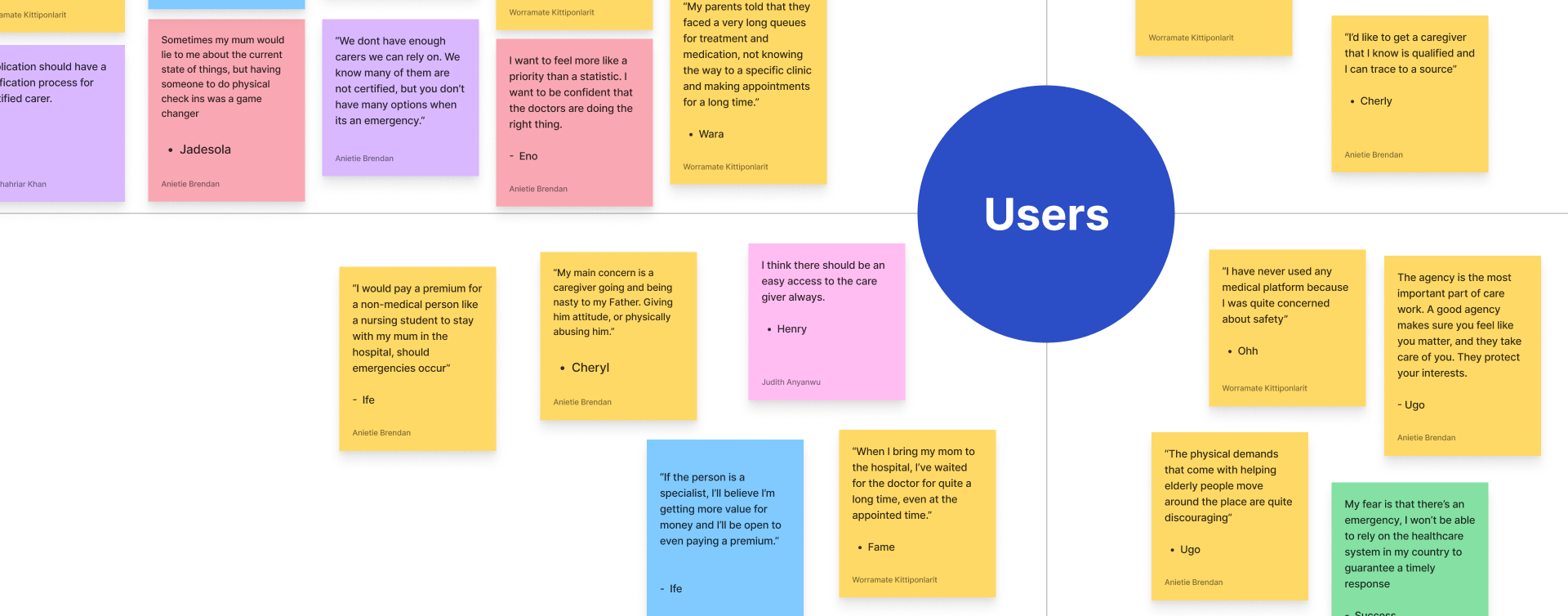
Empathy Mapping
By sorting the responses from the interviews into quadrants of things they said, things they felt, things they thought and things they did, it became easier to get closer to the user's perspective and identify the core emotions behind the responses.
Key Realizations
01. Time is of the essence
About 46% of the people we interviewed complained about long wait times before meeting doctors.
02. Quality is an indicator of standards
25% of the people we interviewed expressed concerns regarding the quality of service they receive.
03. Health is Wealth
25% of the people say they don’t mind paying extra as long as it guarantees that they get the best care for their loved ones.
04. Caregivers need care too
34% of the people we interviewed are caregivers and they expressed their frustrations with abusive patients and agencies poorly protecting their interests.
02. DEFINE
Our Solution
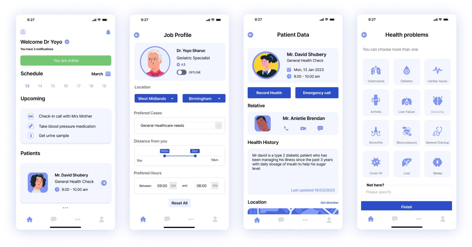
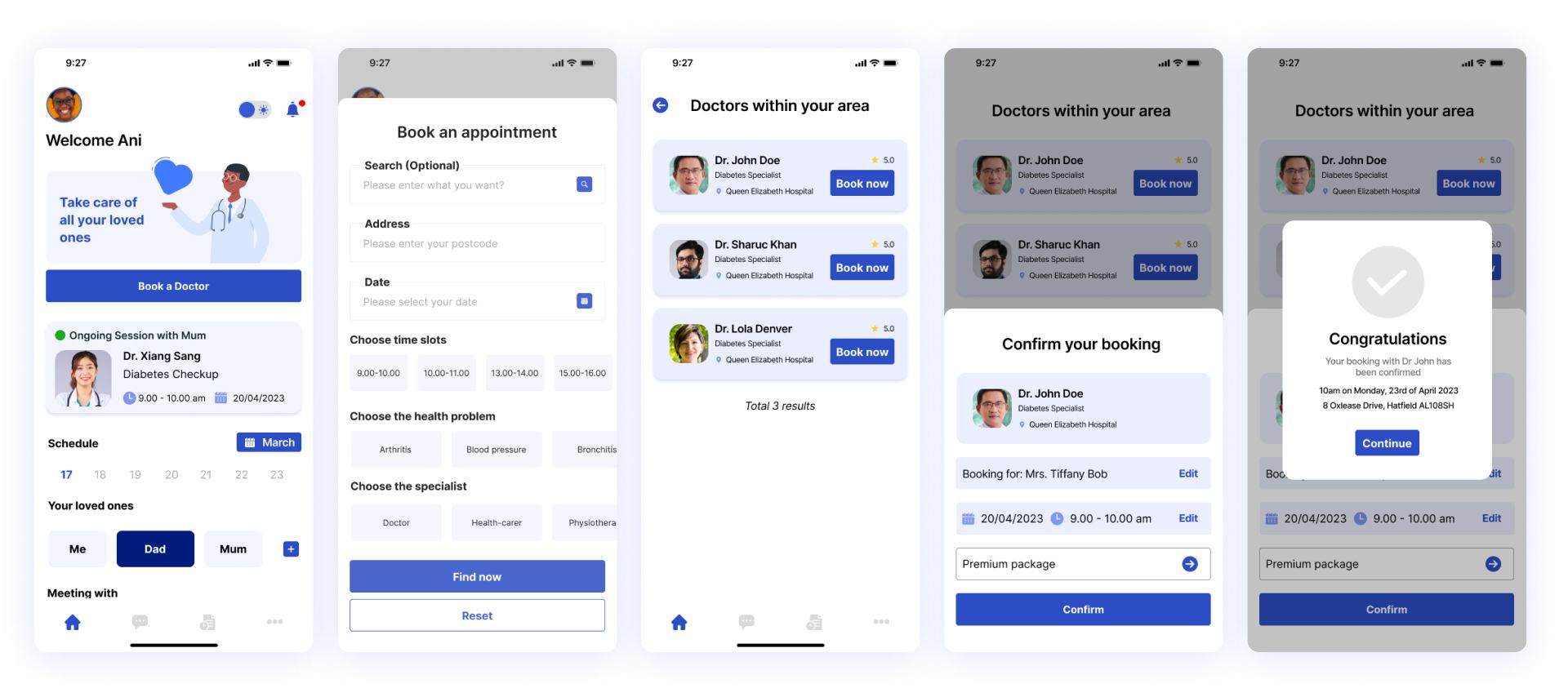
7Care is a telemedicine app that leverages the power of community to provide healthcare solutions in a more timely and effective manner than the local service providers.
The app allows users to find caregivers and assign them to their loved ones for frequent visits and regular healthcare benefits while monitoring the state of things, without having to be physically present.
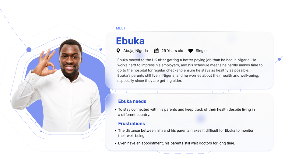
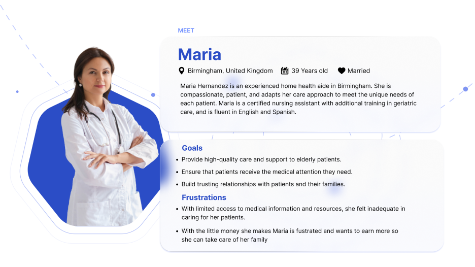
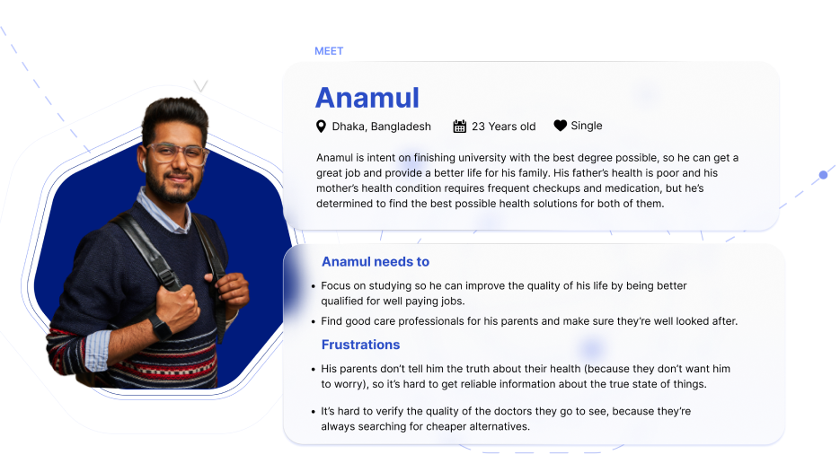
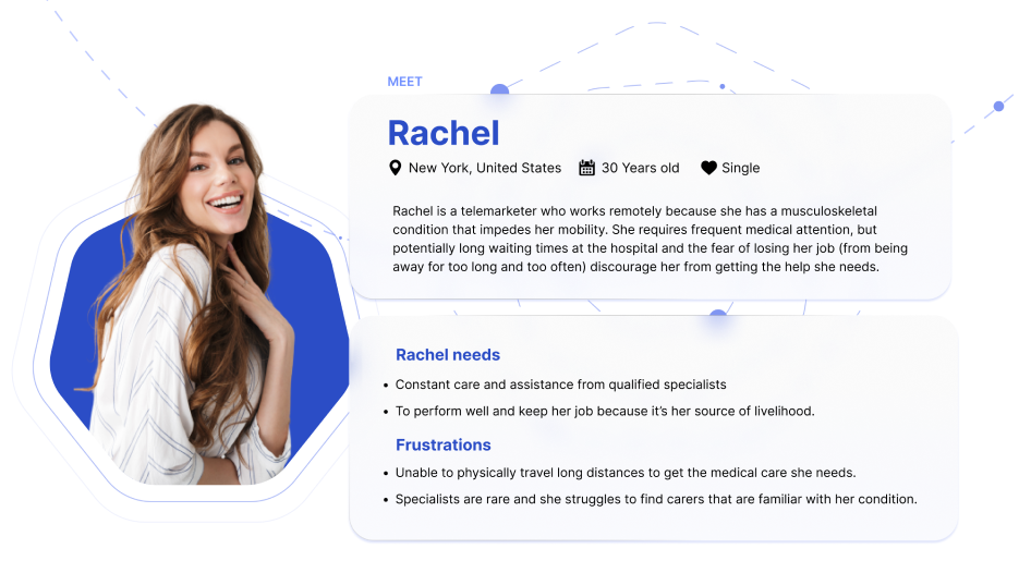
Personas
Building personas from the data in our interviews
helped us empathize with our prospective users, share their perspectives and understand their pain points.
03. IDEATE
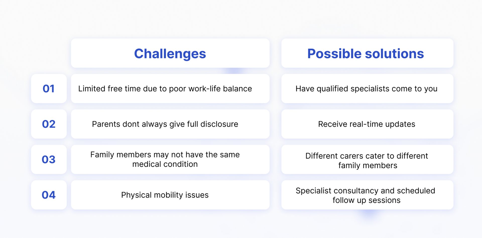
How Might We?
Asking ourselves “how might we turn these challenges into opportunities” helped us shift our focus from purely analyzing the situation to trying to solve the problem.
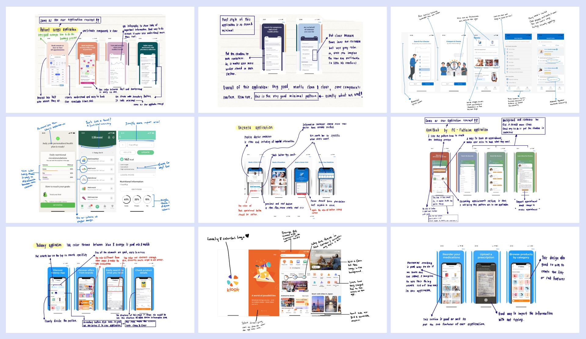
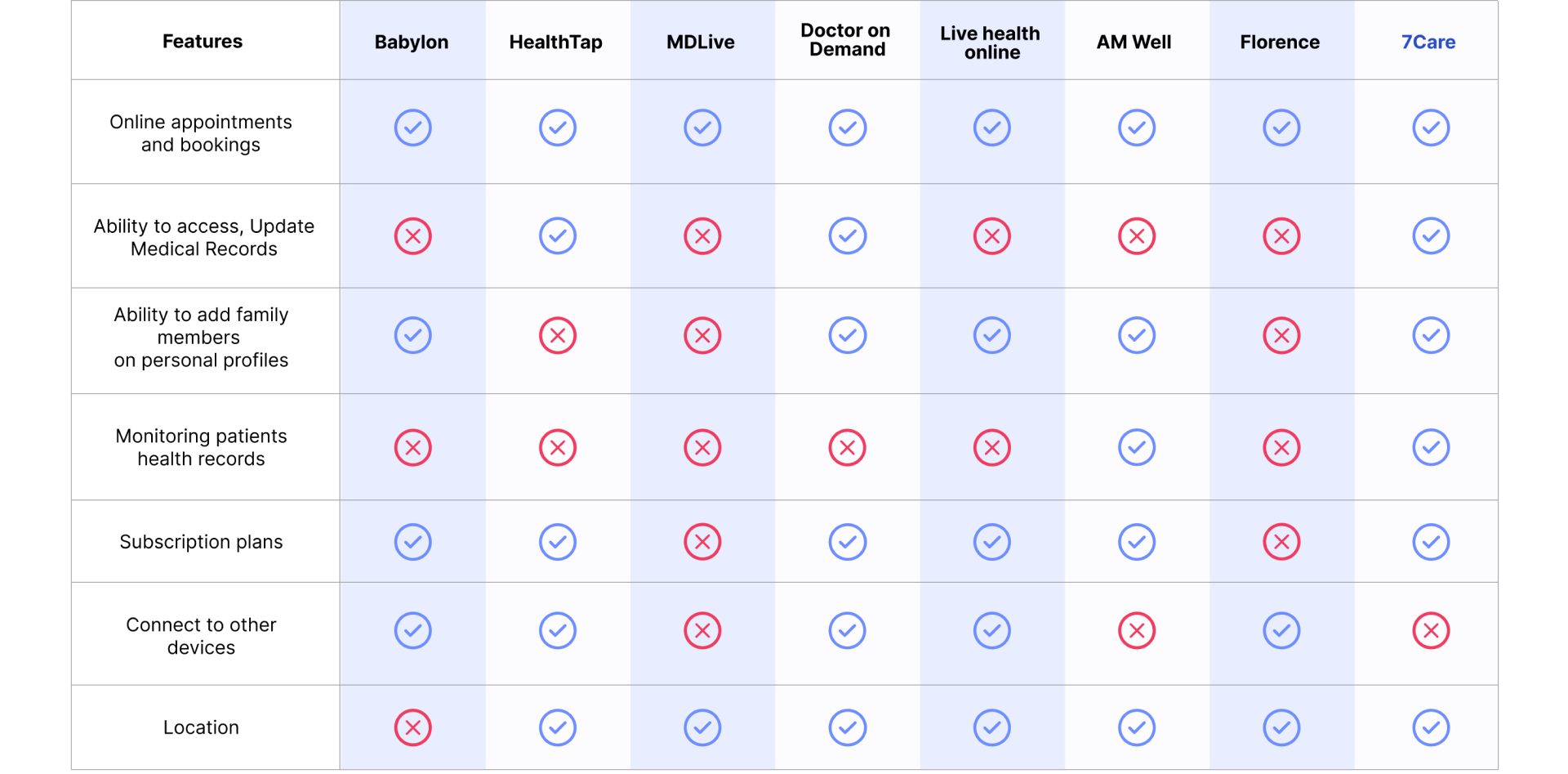
Competitor Analysis
It was important to analyze other applications that already existed within the space we were designing for. Identifying their strengths and limitations could help us explore missed opportunities and offer extra value to the end users.
Key Features
We settled on four key features that will deliver the proposed solutions for our target users.
- Find specialists near you
- Recieve real-time updates
- Cater to multiple family members
- Consultancy and Follow up
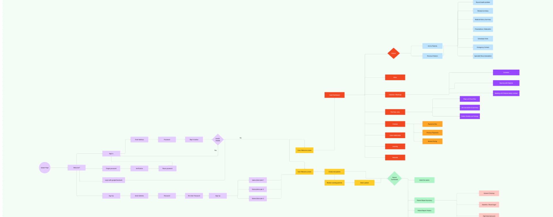
Information Architecture
Knowing our core personas and key features, we listed all other possible features of the application and began sorting cards to allow us get a better understanding of the user's mental model. We analyzed the responses thoroughly to match the users needs and we structured the presentation of information on our application within that framework.
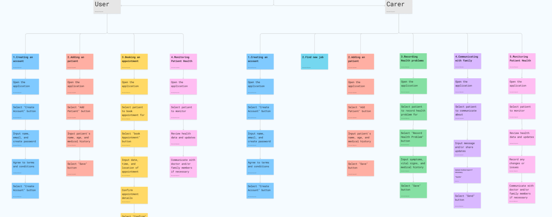
Hierarchical Task Analysis
With Information Architecture sorted, it was important that we documented and structured the tasks to be performed by the users to accomplish specific goals. This helped us assess some of the processes an design them to be more intuitive and user-friendly.

04. PROTOTYPE
Design Criteria
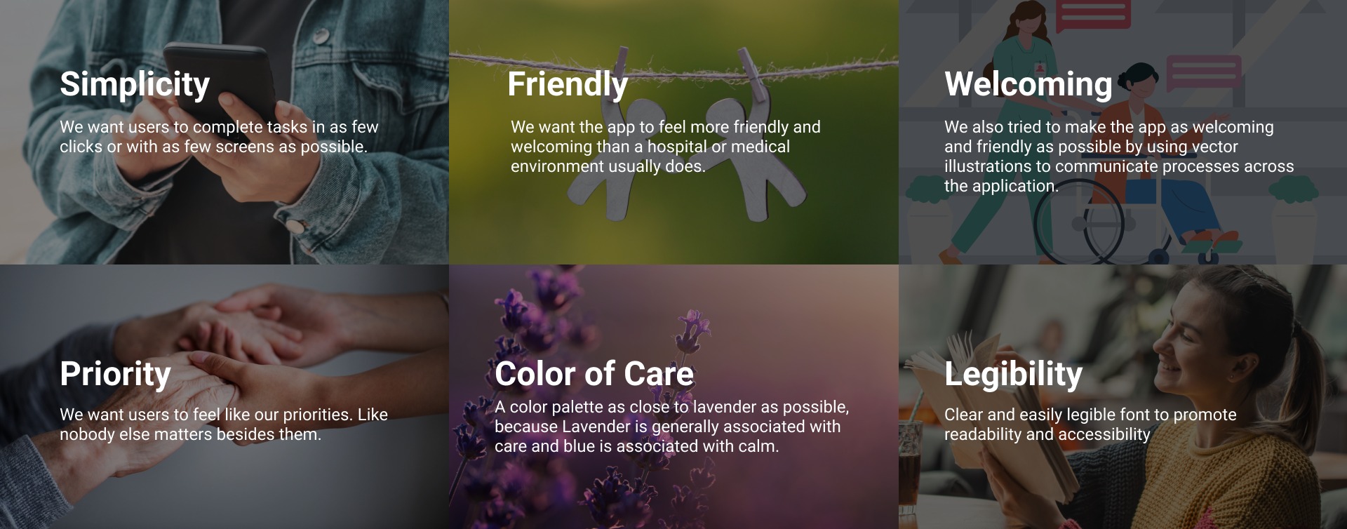
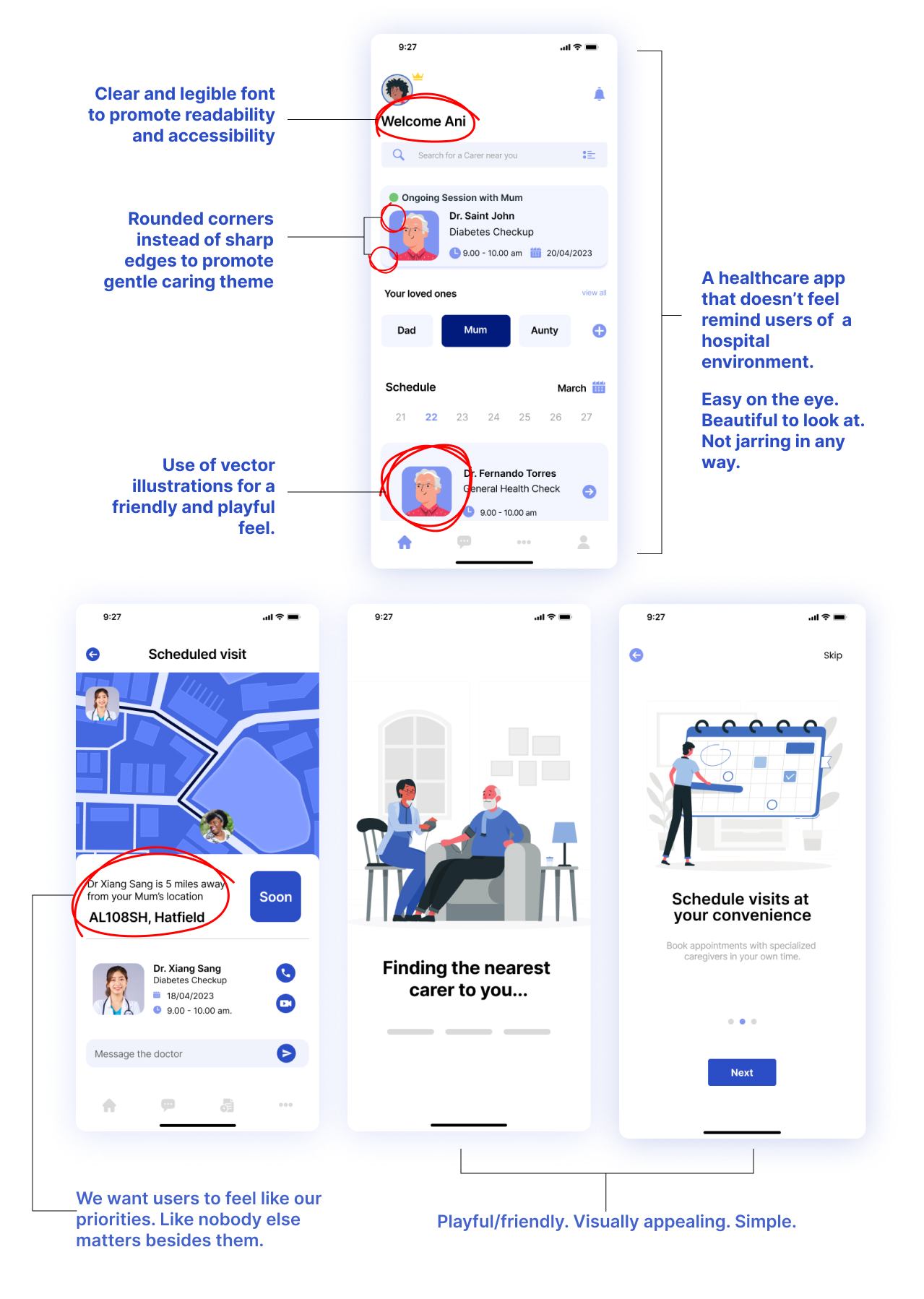
We set some guardrails to keep the design team on track as we transitioned from ideation to execution. From the data previously gathered, these standards were invaluable in aligning with stakeholders and providing rationale for our design decisions.
The care theme informed most of our visual design choices. We wanted to build a solution that met the following criteria.
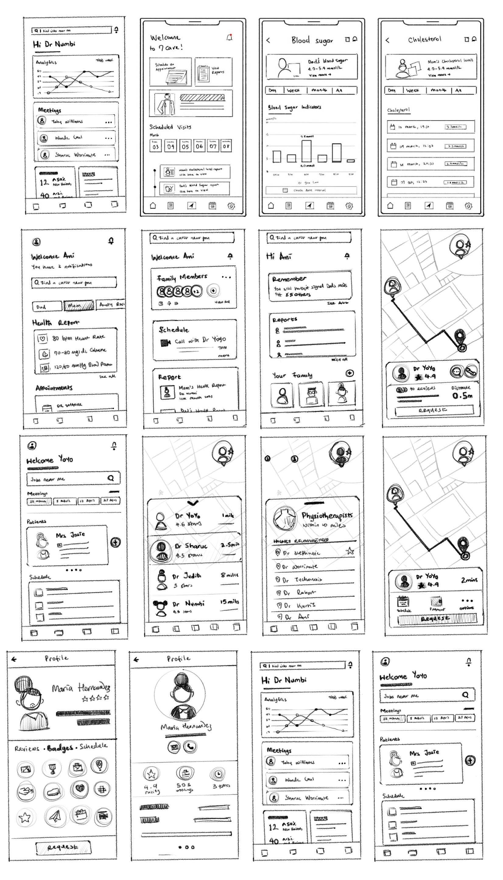
Sketching and Exploring
We began sketching and exploring possibilities. The challenge was presenting the information while maintaining visual appeal and eliminating clutter. It was important that the information was easy to process at first glance, and that (from a visual design perspective), the user didn't feel any form of confusion or uncertainty while using the application.
Color Palette
During our research we noticed the other apps operating in this space used color palettes between lavender, blue and green. We dug deeper and learned that blue and lavender are colors that connote care and relaxation. However, a lot of accessibility issues come with lavender due to its poor visibility to colour blind people.
Here’s the palette we eventually went with.

Accessibility Considerations
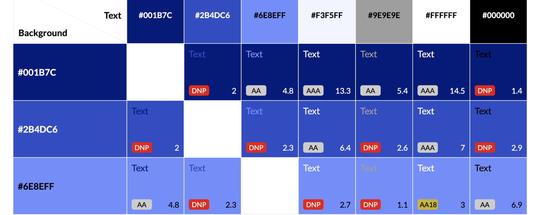
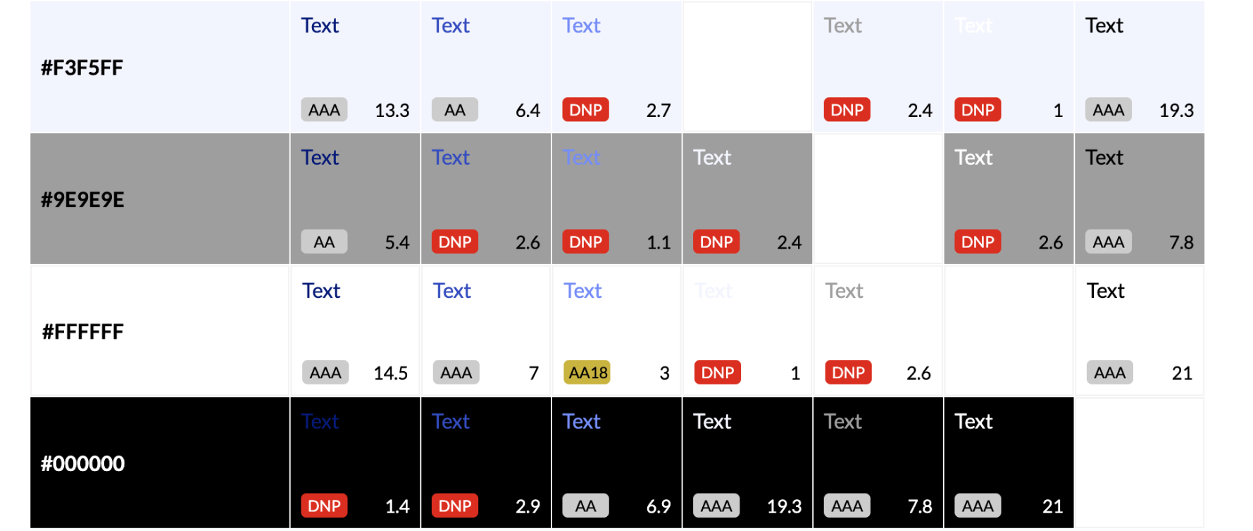
We used a contrast grid to ensure that the color combinations we chose met accessibility standards for users with visual impairments.
For each state, we chose color combinations that had high enough contrast ratios to meet the accessibility guidelines. We also tested our color choices using the Color Oracle software, which simulates different types of visual impairments to ensure that our color combinations were distinguishable to users with varying levels of visual fidelity.
Final Design
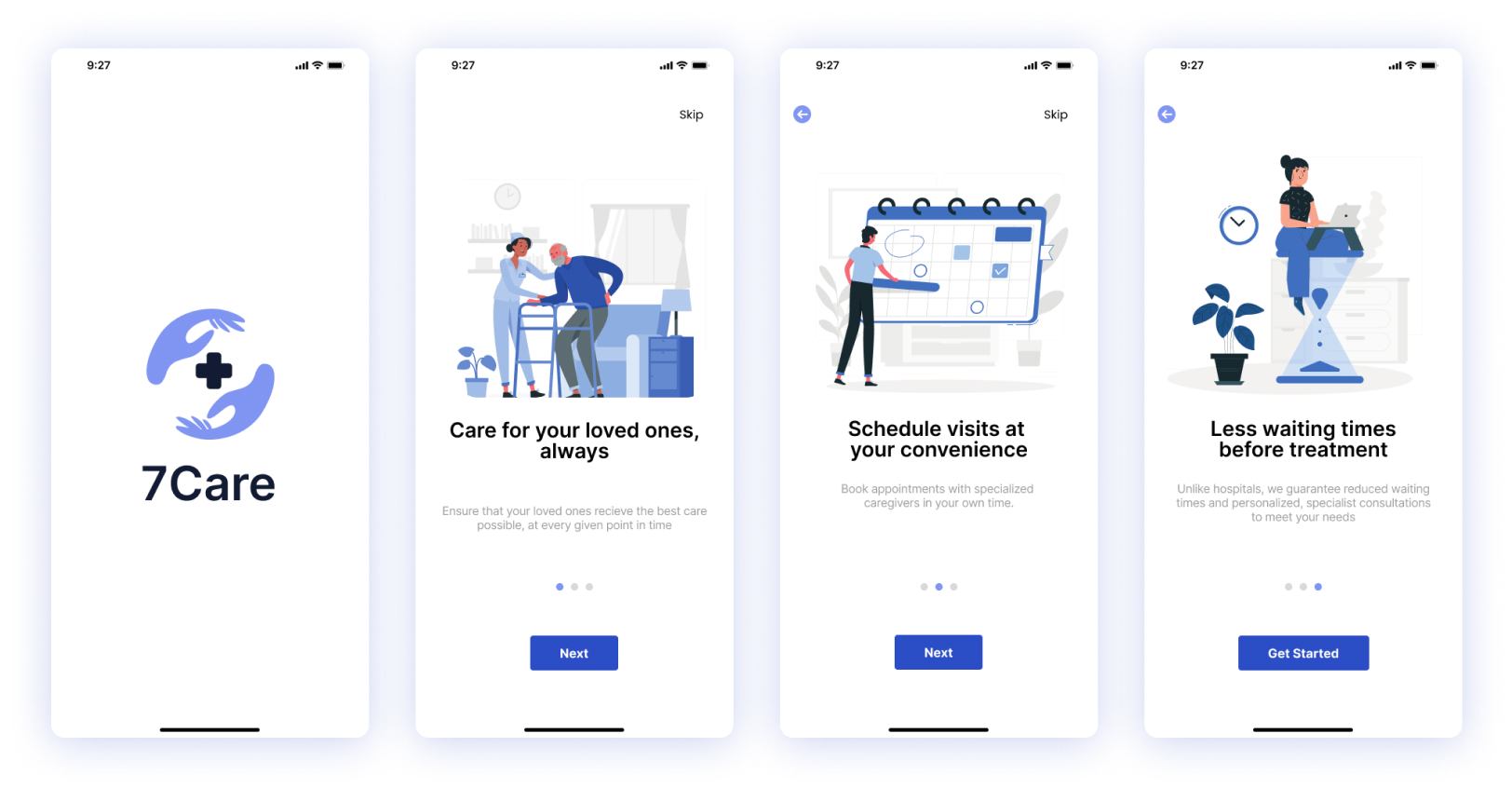
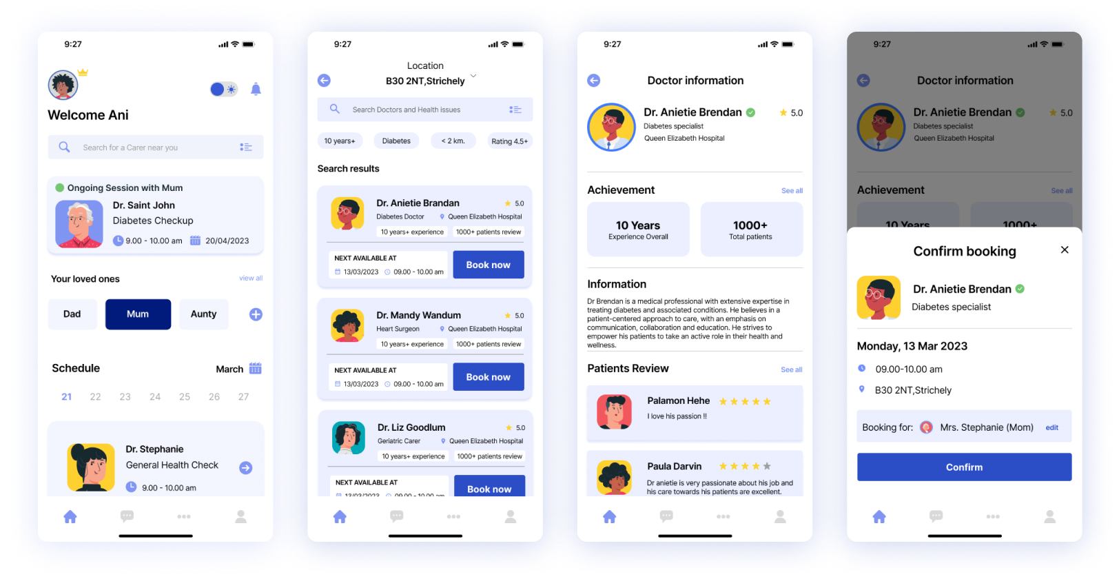
In 10 weeks we designed the 7Care application, and after two rounds of user testing and a system usability scale score of 82% we wrapped the project up.
I'm happy to share findings from the user study and a full case study document (yes, there's more) if you're interested in viewing it.
Credits
Design
- Anietie Brendan
- Stephanie Numbi Francis
- Shariar Khan
- Judith Okwuose
- Worramate Kittiponlarit
Supervision
- Robert Sharl
- Kurtis Blanc